01 — Concept
Investing to
truly live
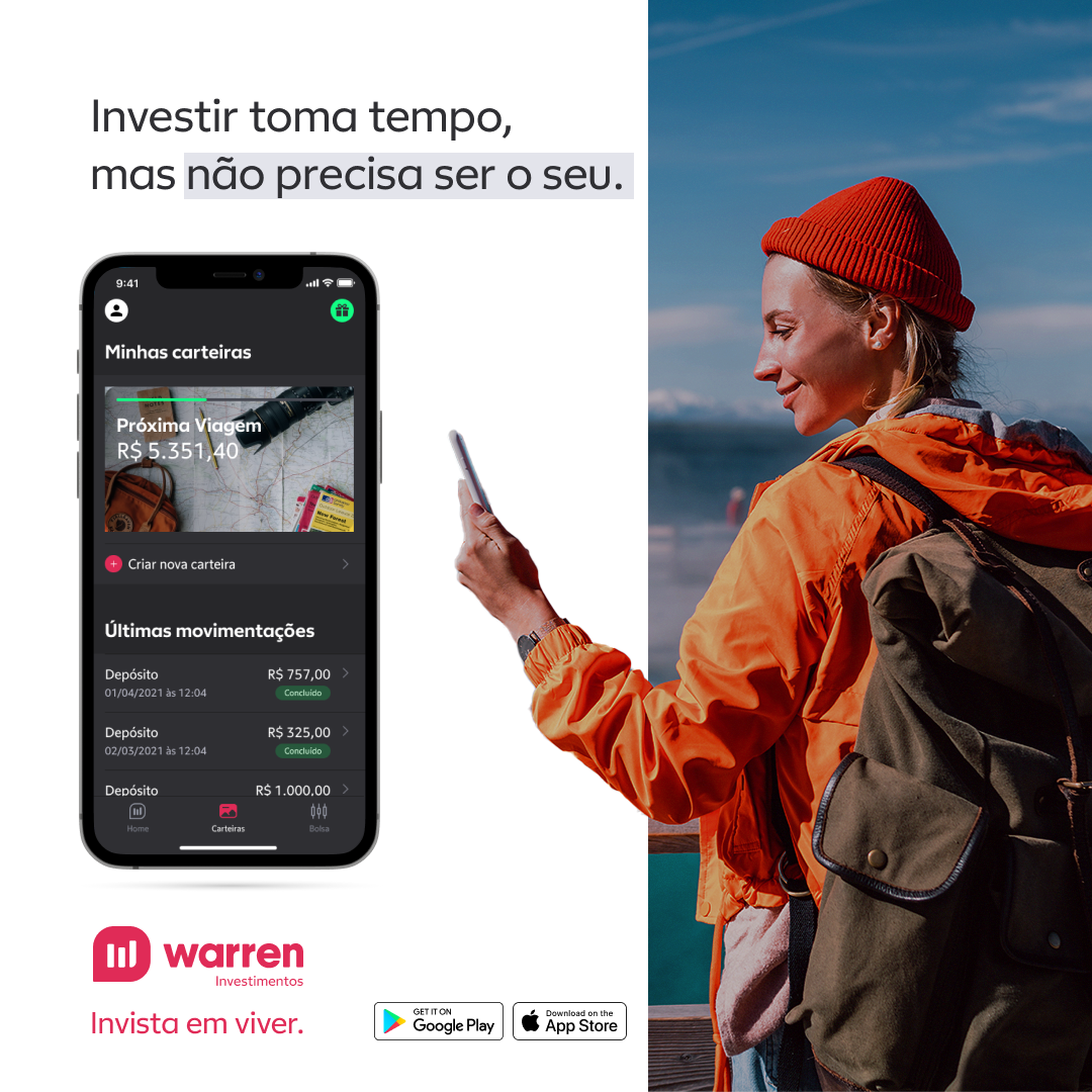
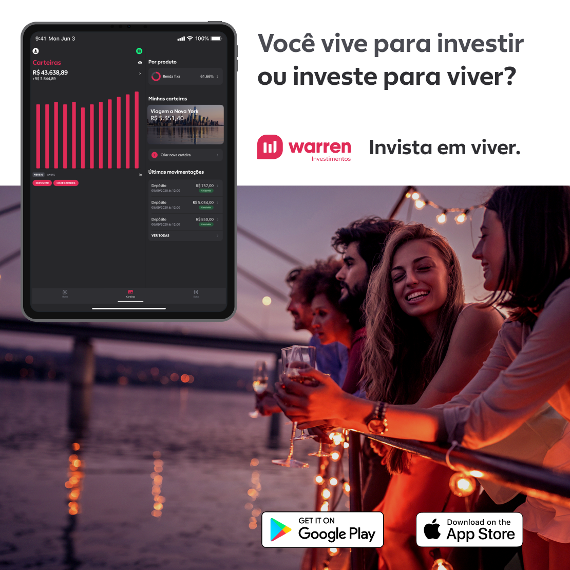
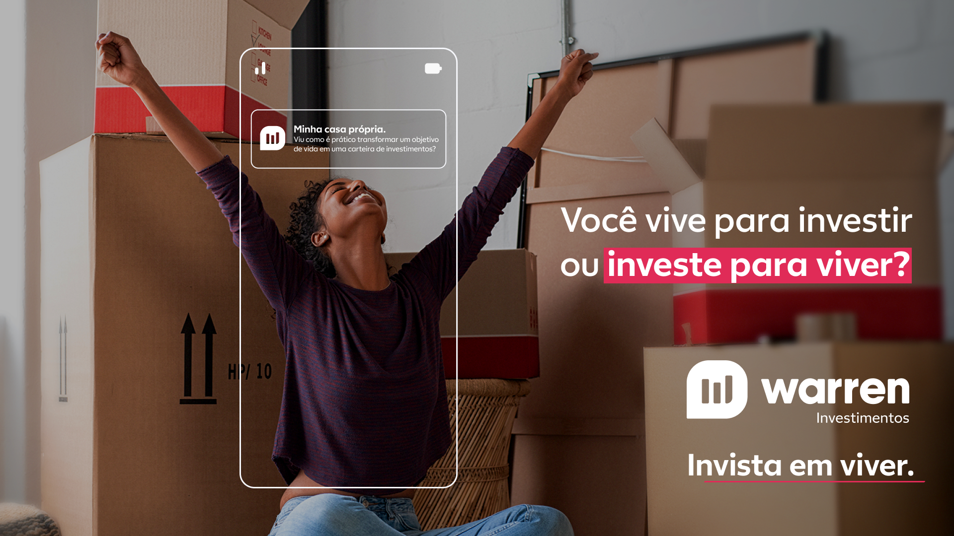
Warren is not just an investment platform — it's a philosophy that money should work for you, not the other way around. The "Invista em Viver" campaign explores this territory: real moments, concrete desires, the life you want to build.
The art direction combines photography with strong emotional weight, impactful typography, and a palette that balances financial seriousness with human warmth — Warren green as the anchor, warm tones as an invitation.
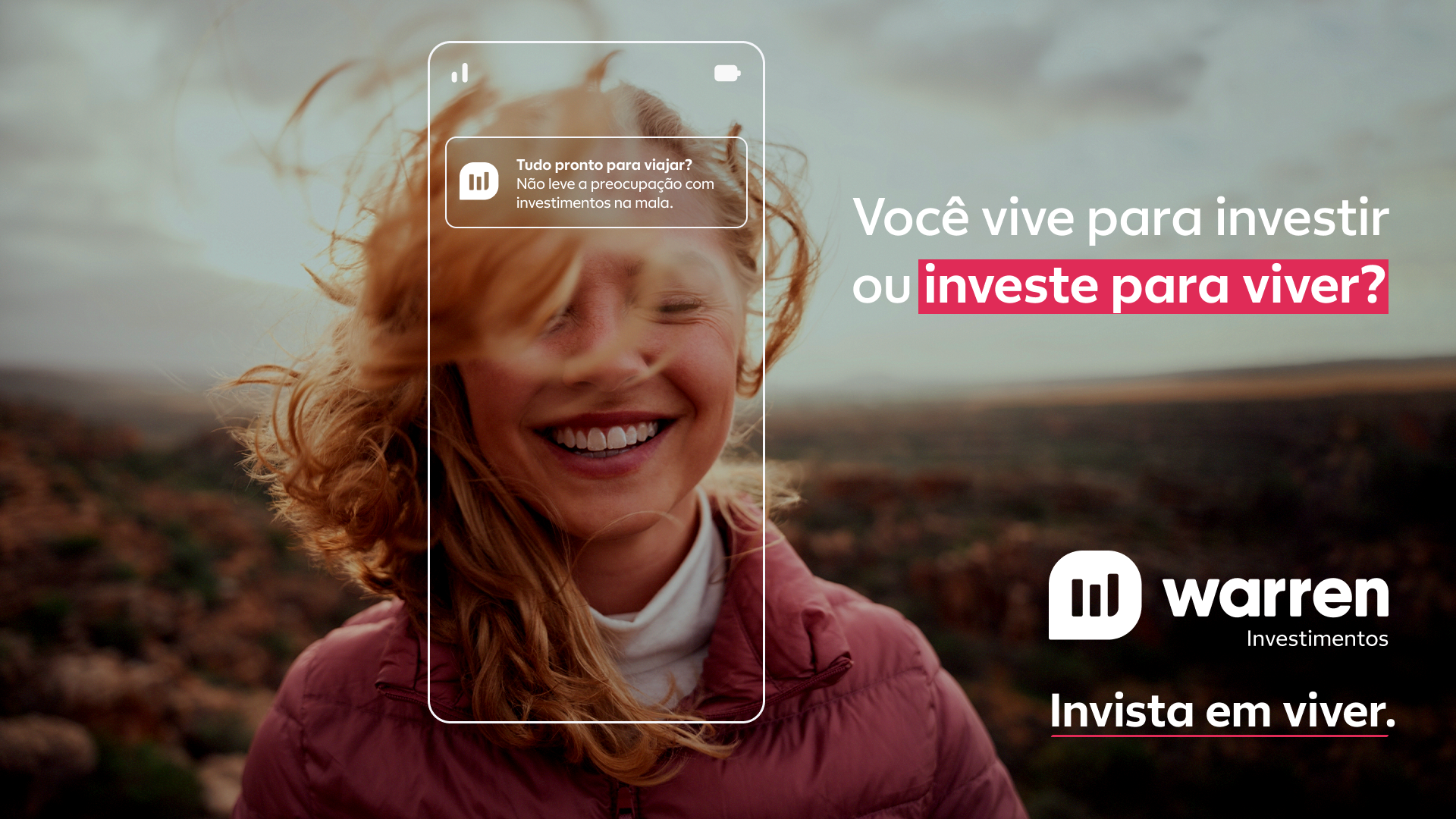
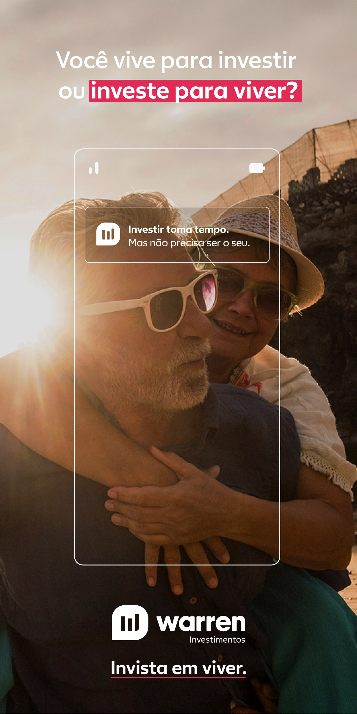
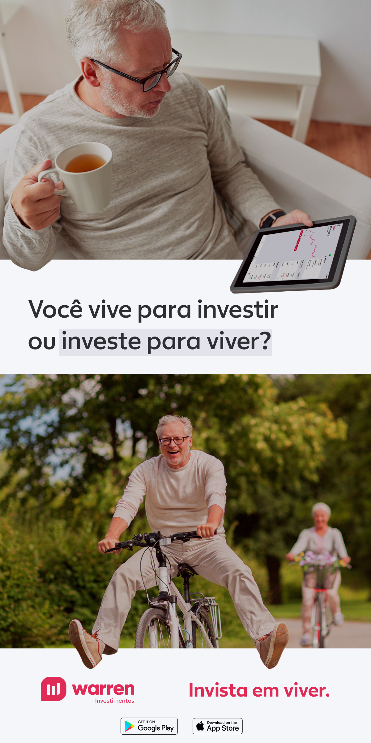
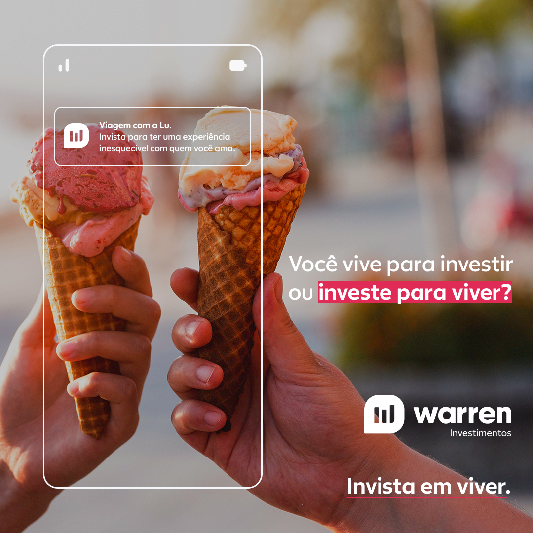
02 — Key Visuals
Versions A, B, C
and D
Each version explores a different emotional territory within the same campaign umbrella — maintaining consistency in the visual system while tailoring the message to different audience profiles.

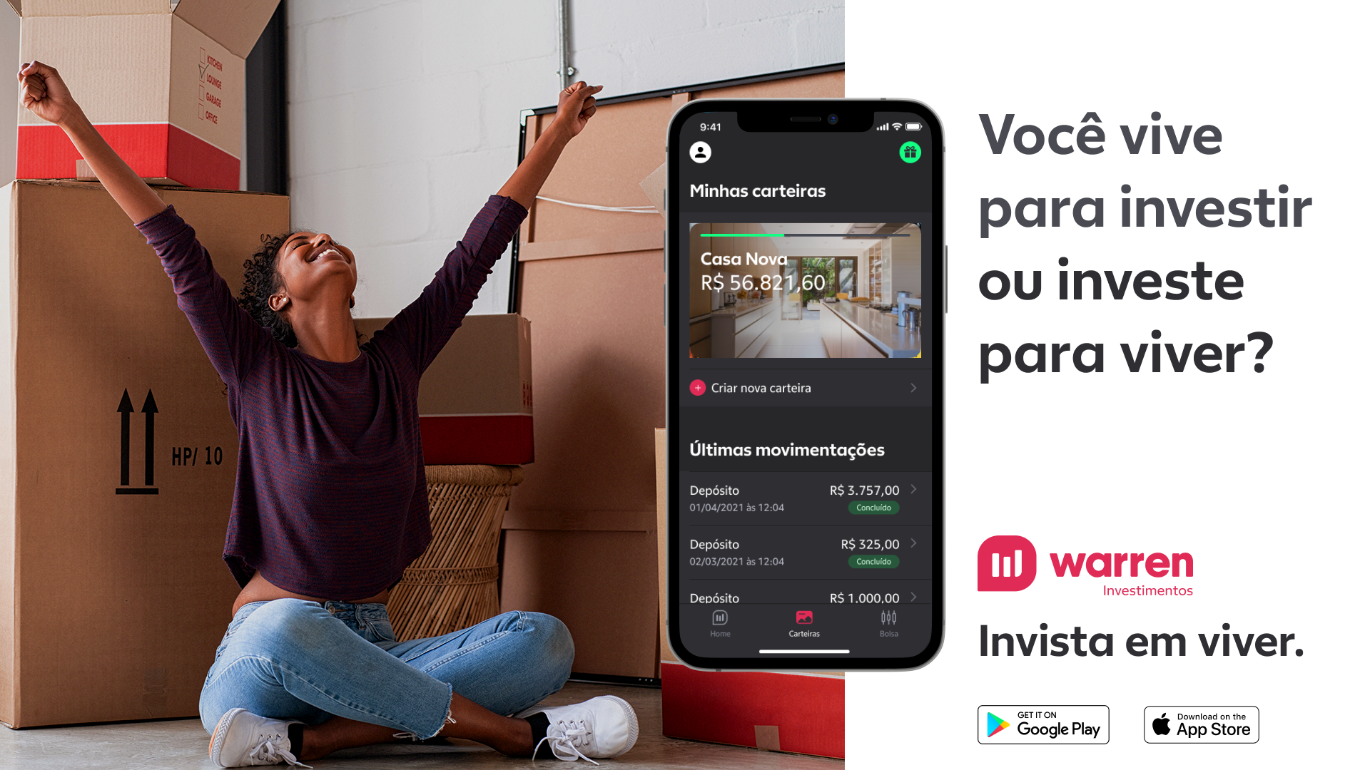
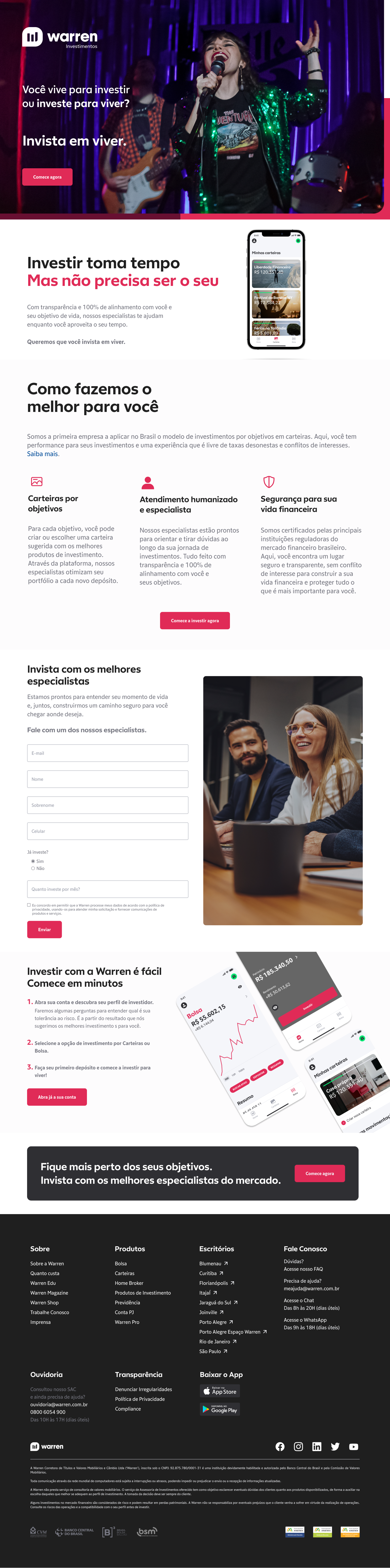
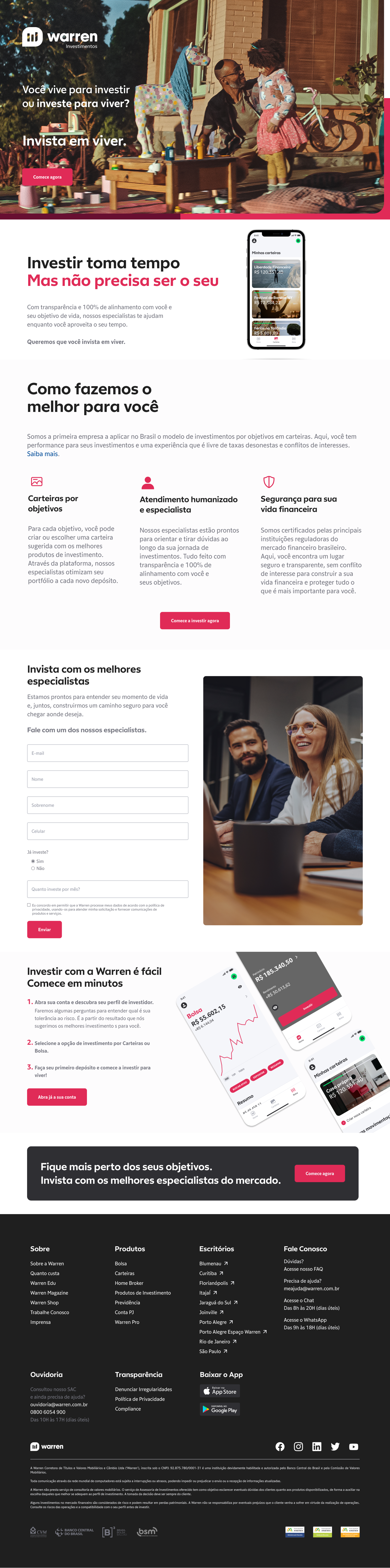
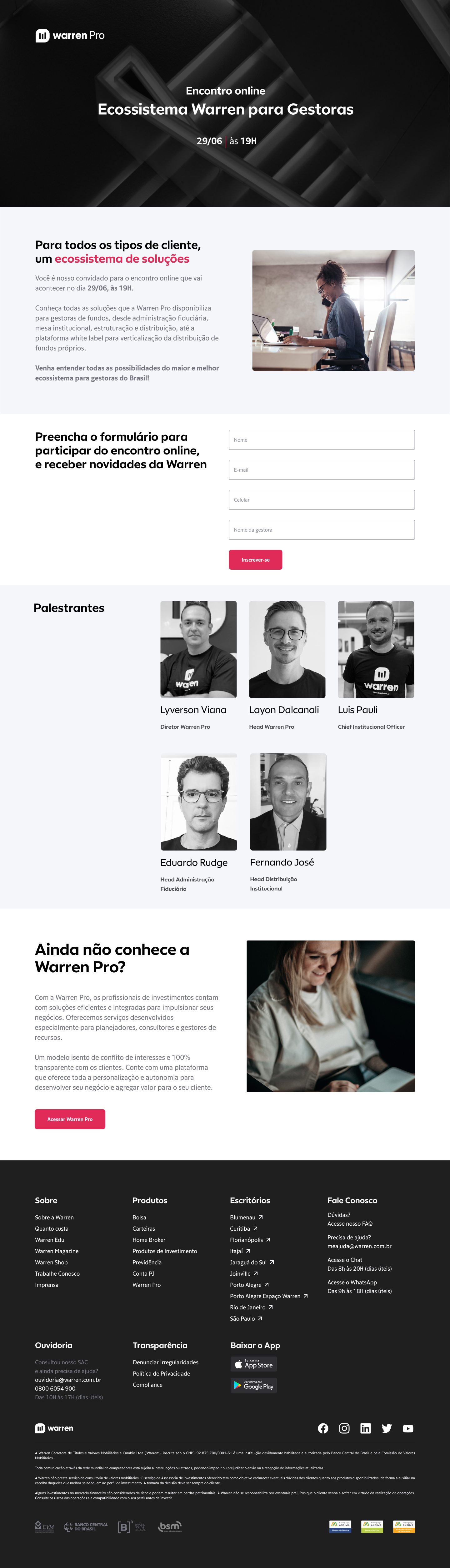
03 — Landing Page
From the ad to
conversion
The landing page extends the campaign territory to the conversion moment — maintaining the key visuals' language and guiding the user clearly from interest to action. Two heroes with complementary visual approaches and a version focused on asset managers.
04 — Deliverables
What was
delivered
05 — Learnings
What this project
taught me
Fintech doesn't have to be cold. The biggest challenge was balancing the seriousness that the financial world demands with the emotional warmth the campaign calls for. The key was anchoring everything in real human photography — concrete life moments, not abstractions.
System consistency with message variation. Producing 9 KVs across 4 thematic versions forces you to build a system before executing individual pieces. Grid, typography, and palette established before the first layout saves hours and ensures coherence.
The landing page is the most honest brief. The LP reveals whether the campaign truly works — it has to hold up to the ad's promise without the compression of a feed format. Designing both together makes the campaign more cohesive and the LP more effective.