An art gallery sells original work online, but its site got in the way of both the art and the sale. This is the redesign, from the usability audit that found the problems to the structure and screens that fixed them.
The catalogue holds work from 120 artists. The site sent visitors into it with no map, no introduction, and a store they had to dig for.
The brief
Galeria Carbono represents more than 120 artists and sells original pieces directly through its website. Two jobs sit on the same pages: present the curation like a gallery, and sell the work like a store. The live site served neither well, so the project started by finding exactly where it failed before changing a single pixel.
Where it broke
A walkthrough of the live site recorded where visitors lost the thread, where content was unreachable, and where the structure fought the catalogue instead of presenting it. These findings became the brief for everything that followed.
The full-screen banner showed close-ups of a few works and nothing else. Past the logo, a visitor had no idea what Galeria Carbono was or why they had arrived.
The showcases carried no introductory text; details surfaced only on hover, and some hover states did nothing. Visitors were loose in an exhibition with no guide.
The menu led to three places, yet the artists submenu unrolled a list of more than 120 names. Far too much for a navigation element to hold.
The catalogue filtered only by first initial. Each name jumped to a random, sometimes unavailable work rather than a dedicated artist page.
Media was inconsistent, from video to a single low-resolution photo. Technique, medium, certificate and edition all ran together as prose, slowing the read.
The about page, with privacy, delivery and security policies, lived only behind a footer link. The content that builds trust to buy was the hardest to reach.
No captures of the original site are shown here; the findings above are documented from the live-site audit that opened the project.
The turning point
Most of the audit traced back to one root cause: there was no real information architecture. 120 artists lived in a dropdown, the store had no home, and policy pages hid in the footer. Before any visual design, the site was re-mapped so every type of content had a place a visitor could predict.
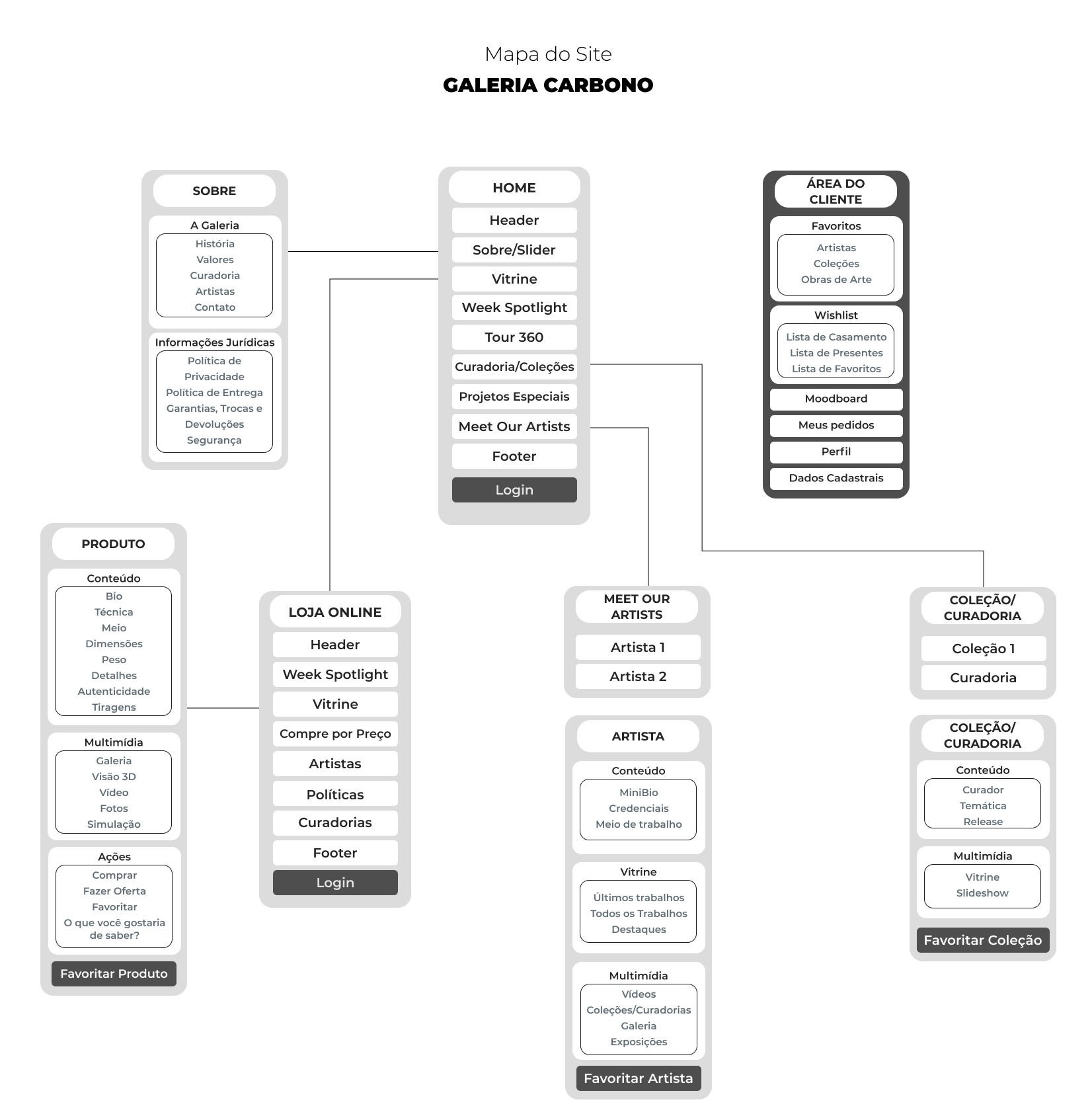
The 120-name dropdown became a browsable catalogue, each artist with a dedicated page instead of a random link.
Collection, product, cart and a client area became first-class destinations rather than pages buried mid-scroll.
About, special projects and policies moved out of the footer into the main structure, where they support the decision to buy.
The idea
A gallery visit begins by walking into the space. The site should do the same: an entrance, a guided route through the curation, and a room where you meet the work.
With the structure settled, one principle guided the visual design. The home becomes the door that positions Carbono. The showcases become a curated route rather than a loose grid. The product page becomes the room where a buyer meets a single piece up close. Every screen that follows is an application of this idea to the problems the audit found.
From problem to redesign
The decisive screens, each answering a specific finding from the audit. This is also where the redesigned home arrives in full.
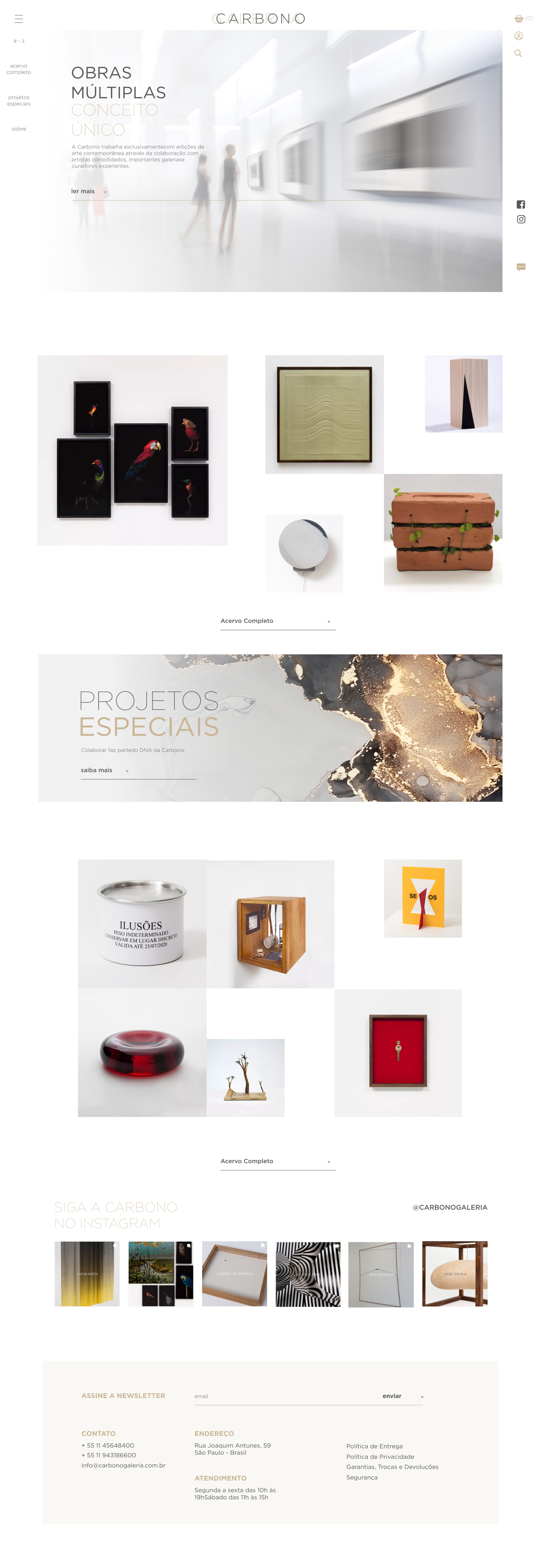
The banner now positions the gallery, its history and its purpose, the way stepping into the physical space does. The showcases below are sequenced as a curated route, and a weekly highlight gives returning visitors a reason to come back and curation a way to steer attention.
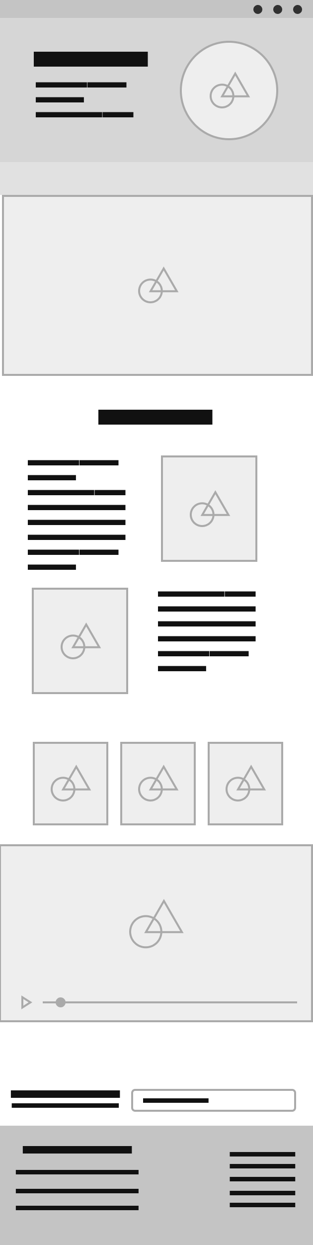
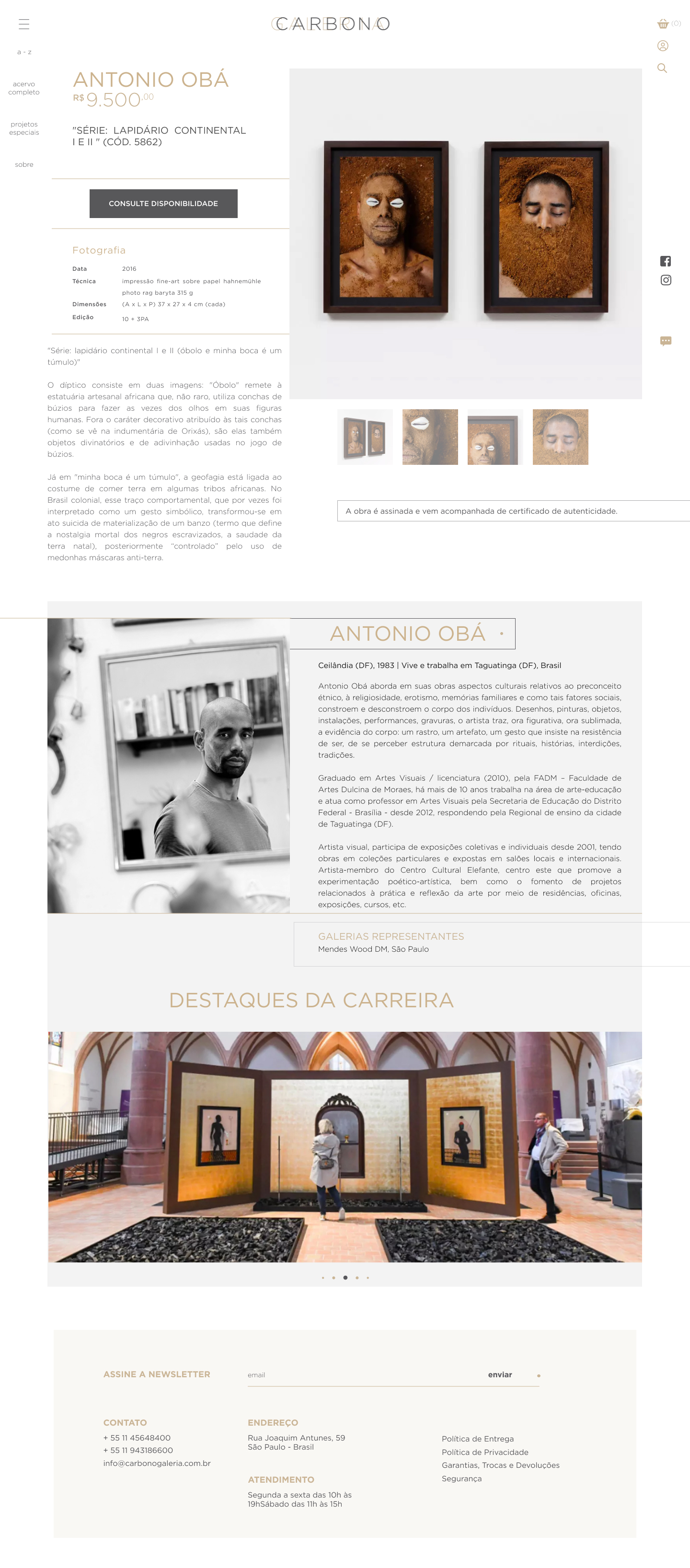
The catalogue pairs each artist with their work, so the list invites browsing instead of scanning initials. Every artist gets a dedicated page built like a portfolio, with their process and available pieces in both text and image, replacing the random links of the old site.
The work is presented with a fuller photo gallery, an immersive slideshow, and room simulation where available. The technical sheet is laid out as a tabulated block, so technique, medium, certificate and edition read in a logical order rather than as one paragraph.
The system
The redesign was structured into a coherent set of components, so it could move into development as a system rather than a folder of mockups.
The overloaded menu gave way to a structure built around the gallery's real destinations, with artists moved to a browsable page.
Home, collection, product, artist and store pages reuse the same blocks: showcases, cards, technical sheets and media galleries, so patterns stay predictable.
Components were organized and consolidated, mapping the redesign to reusable pieces a developer can assemble straight into deploy.
The full set, by area. Select any screen to view it full size.
Home, full page Home, mobile
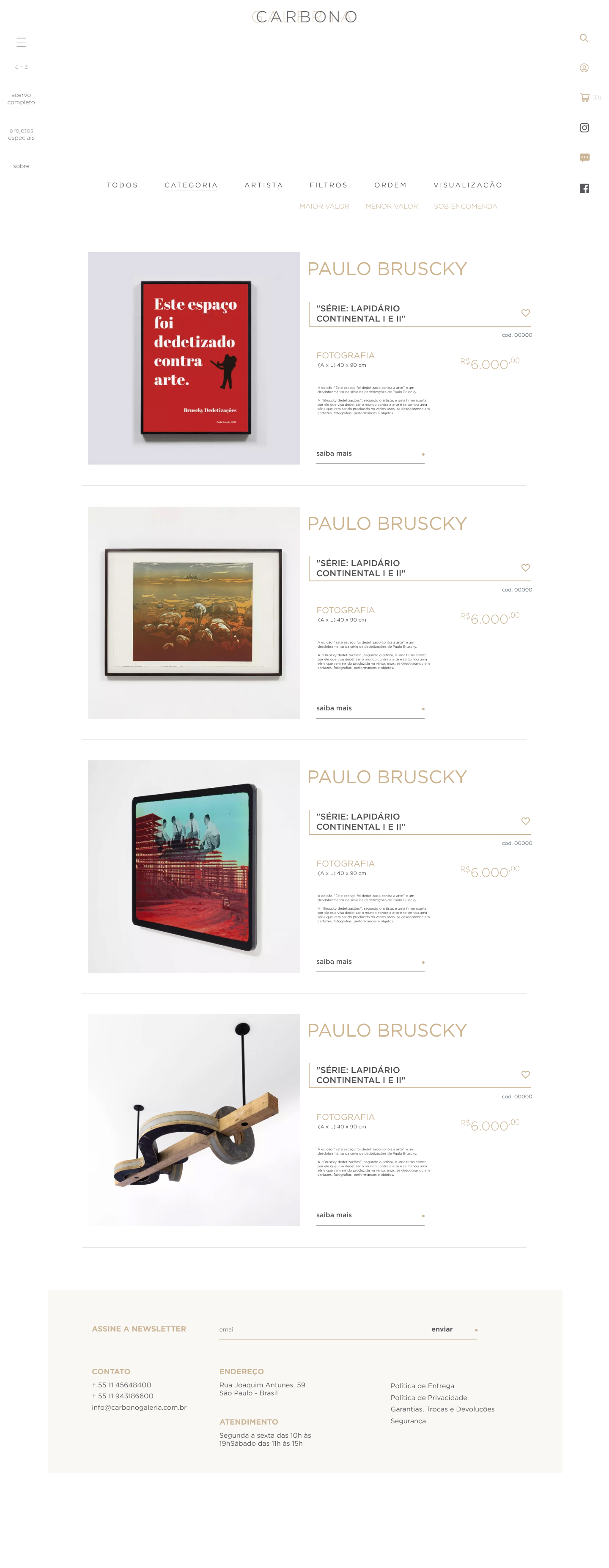 Full collection
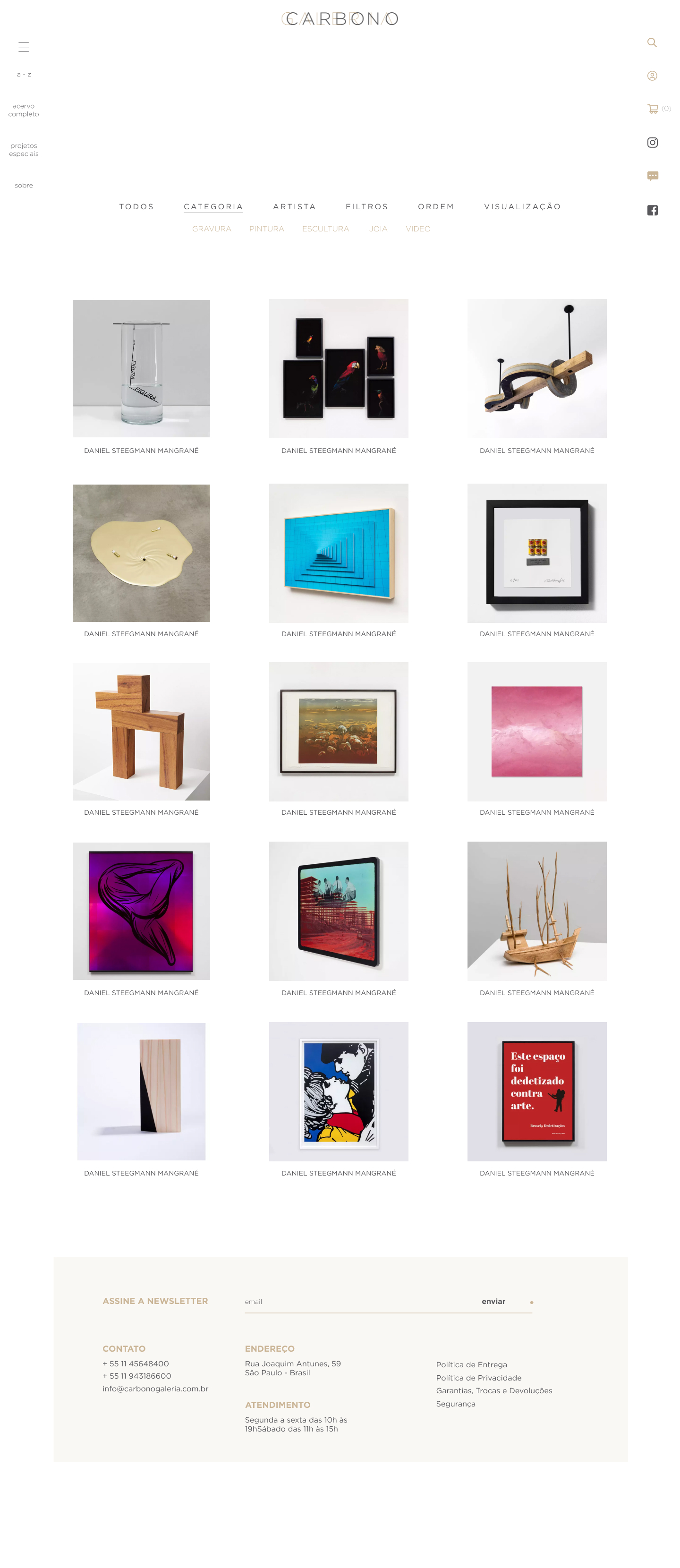 Collection, grid view
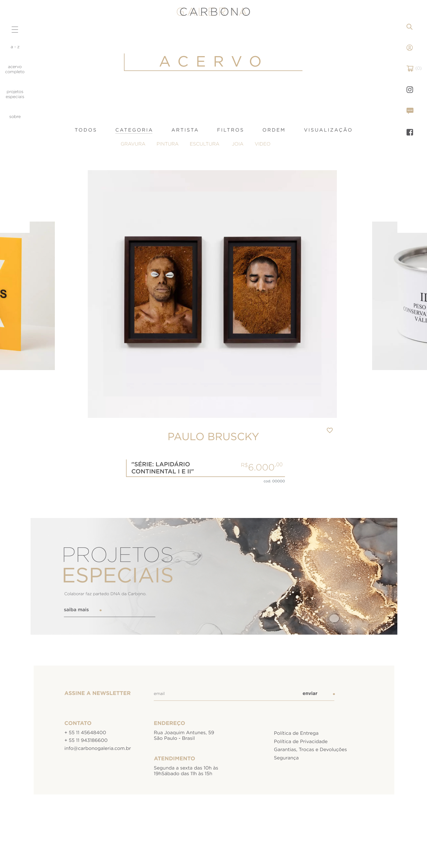 Collection, fullscreen viewProduct page
 Product, mobile
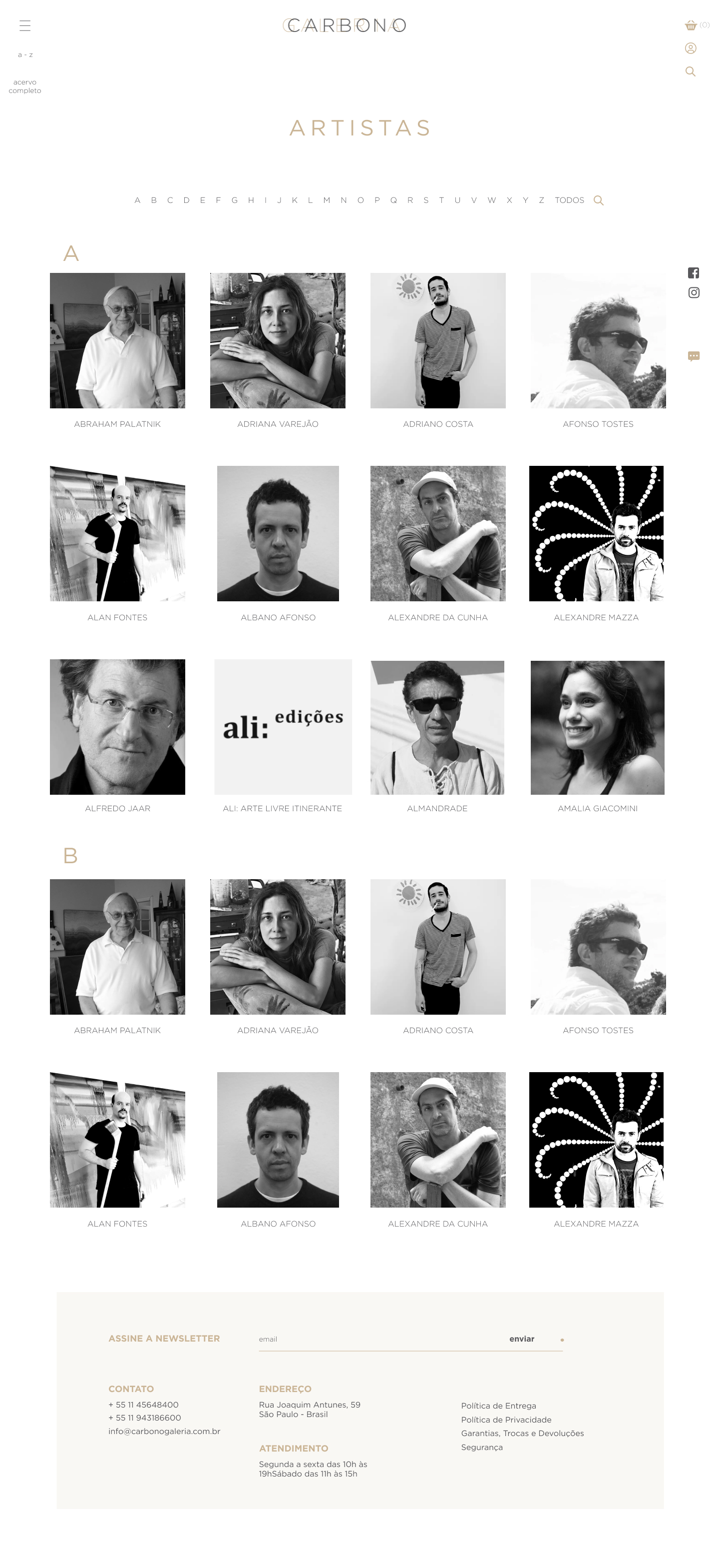 Artists, catalogueArtist profile
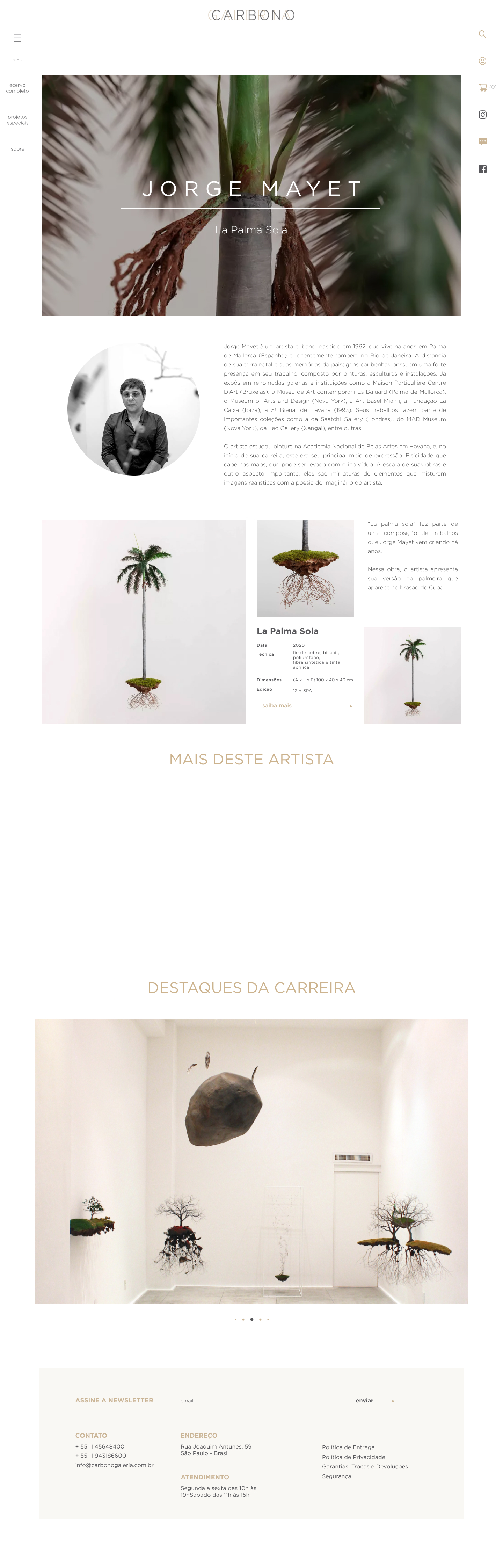 Artist, special feature
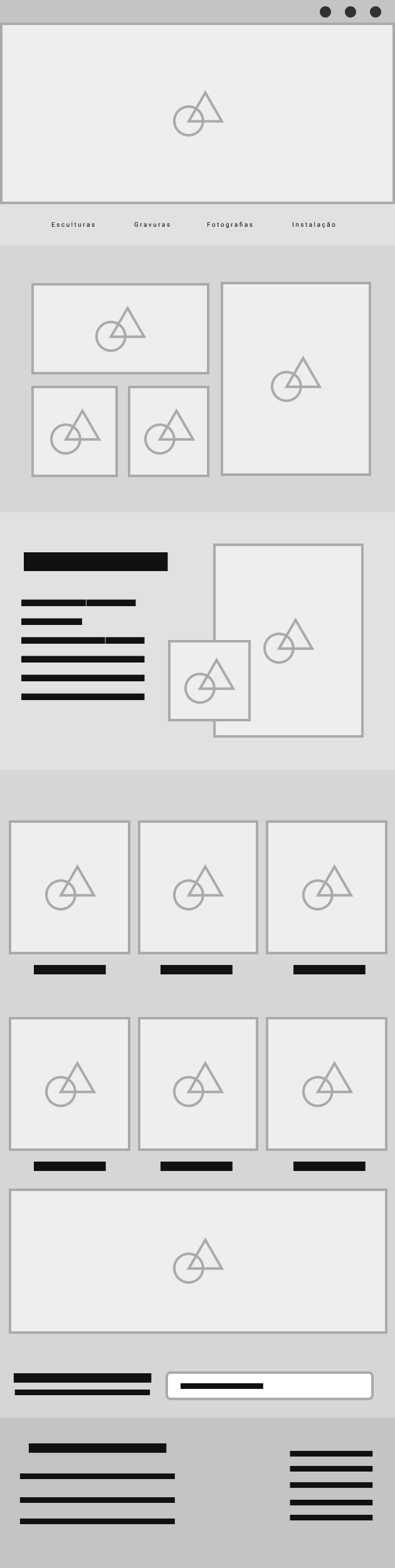 Online store
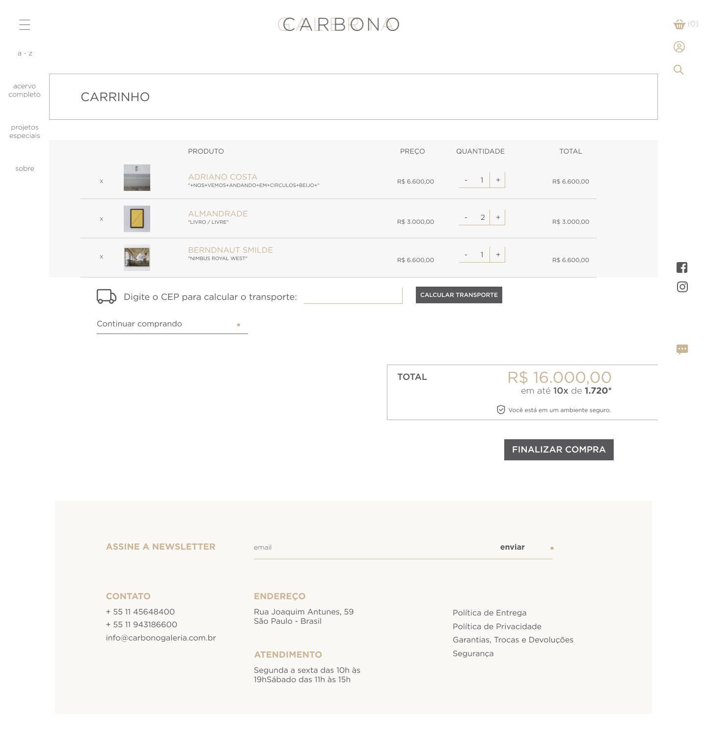 Cart
Cart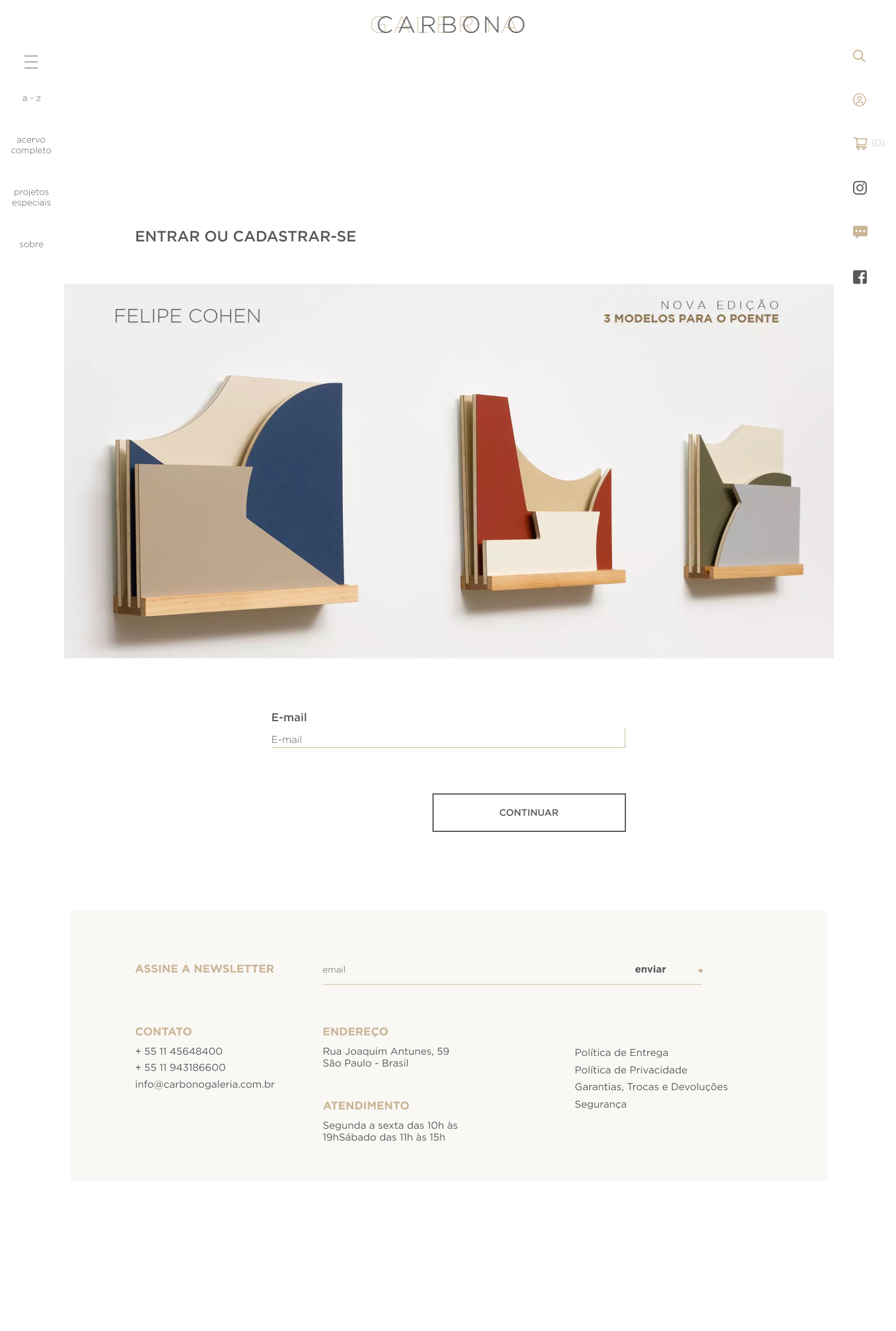 Client area
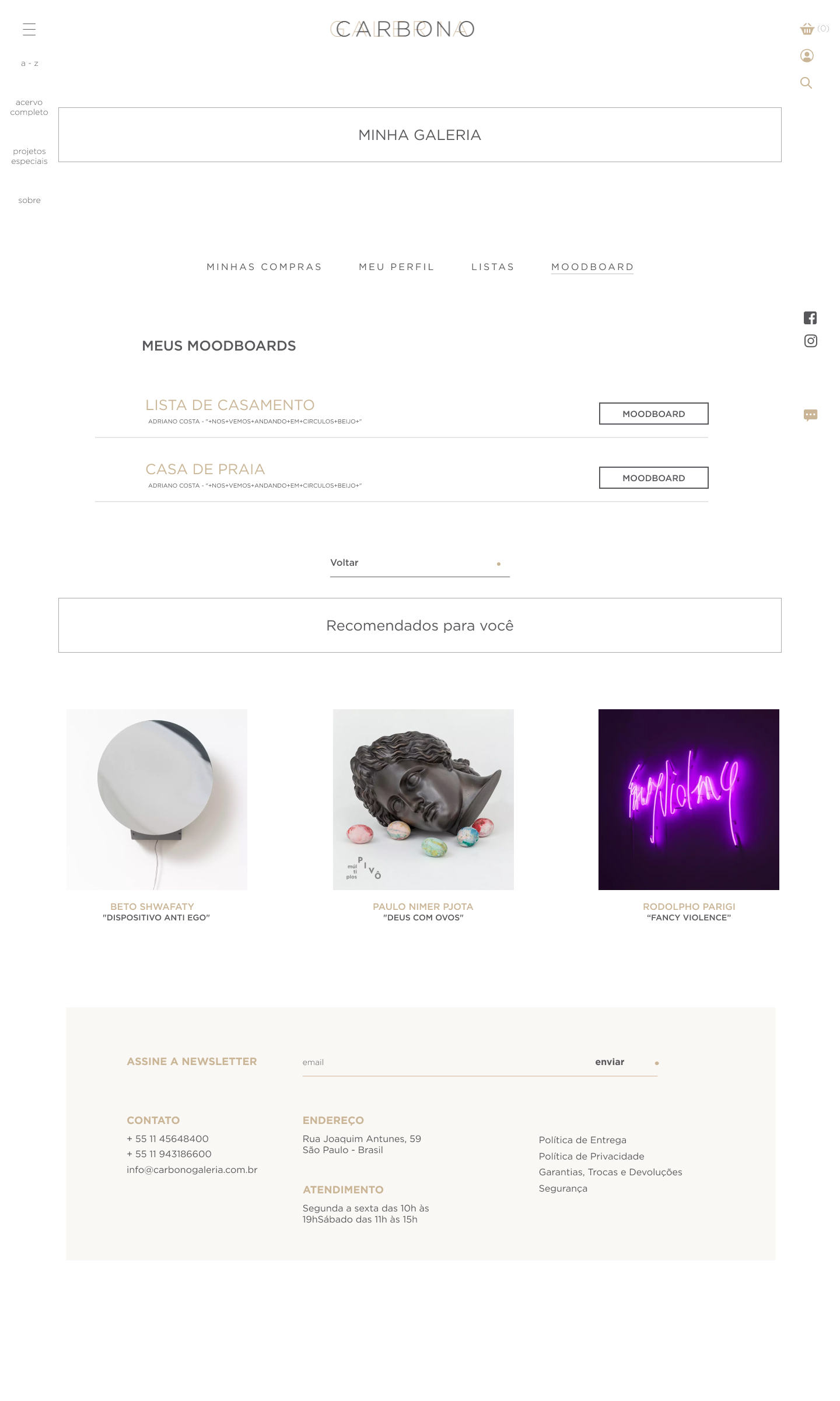 Client, moodboards
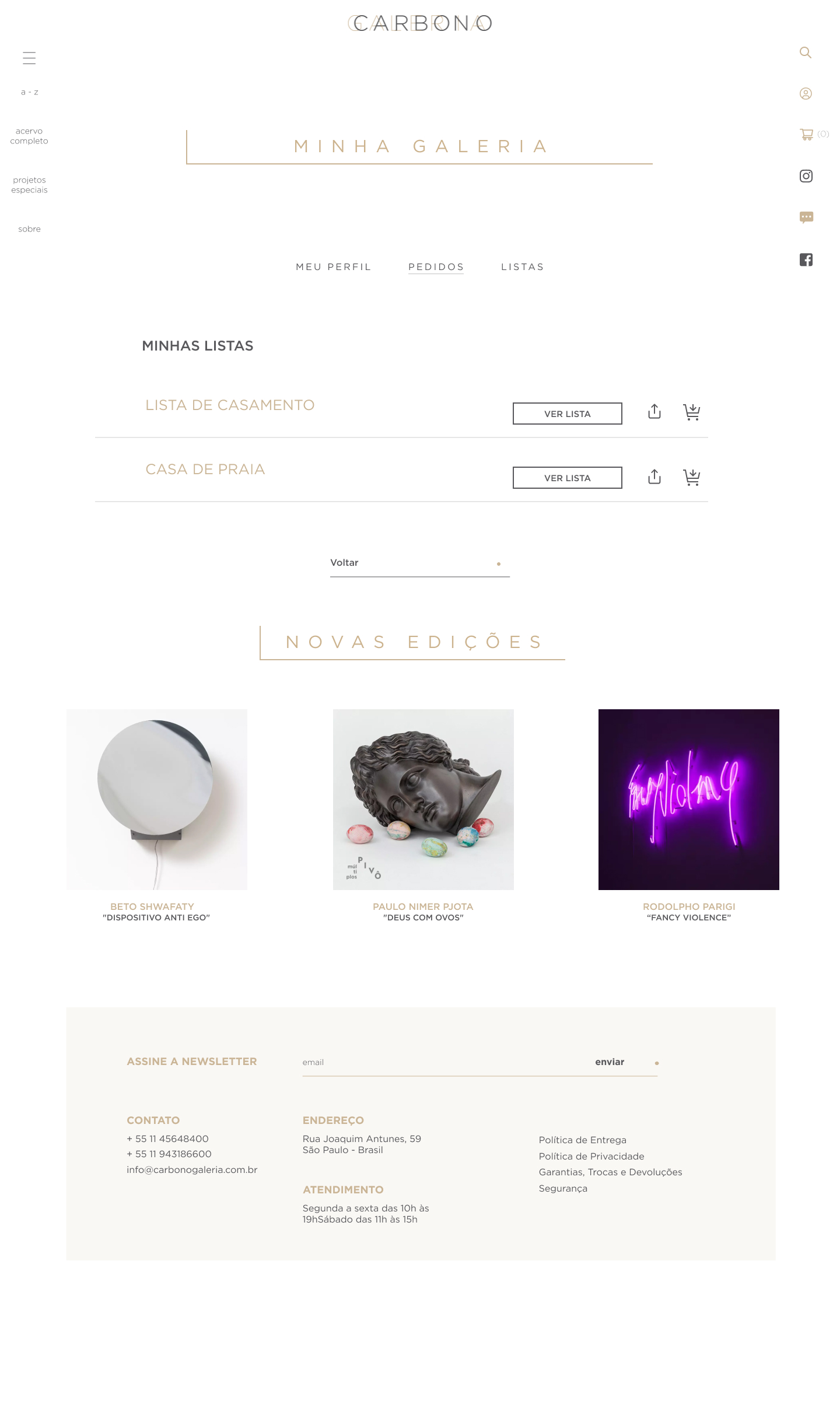 Client, lists
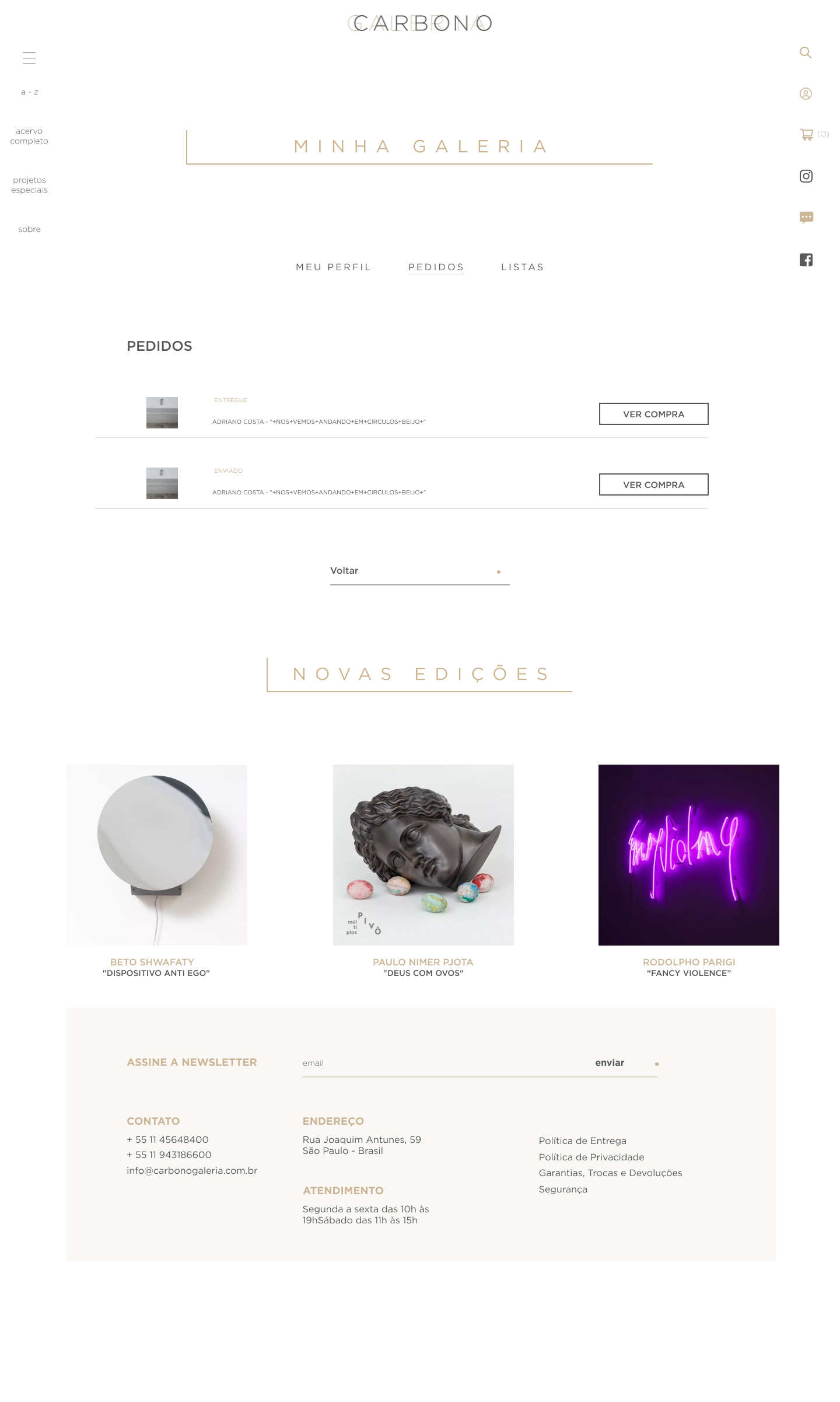 Client, purchases
 Special projects
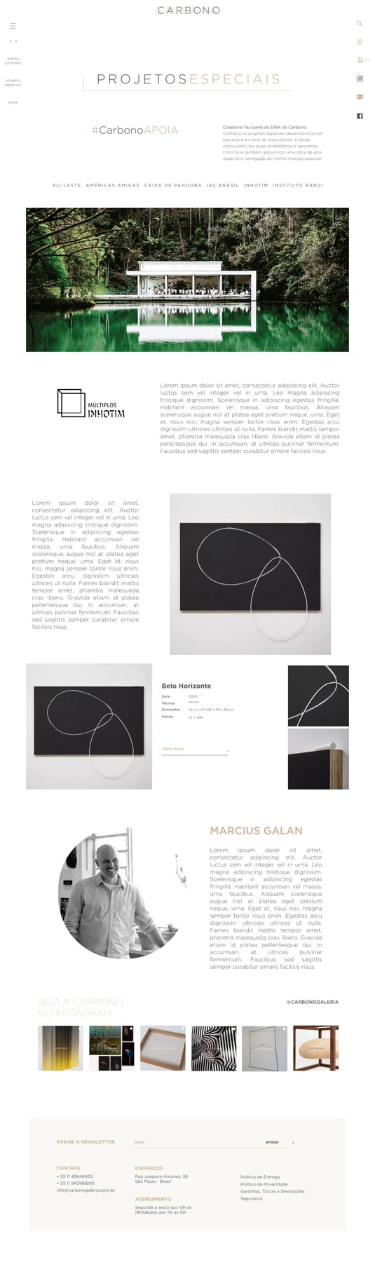 Inhotim
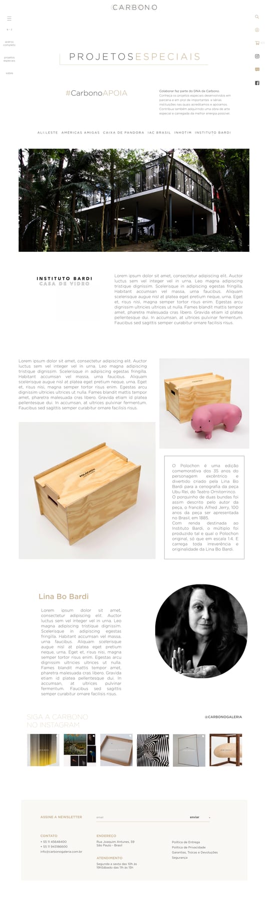 Bardi
Bardi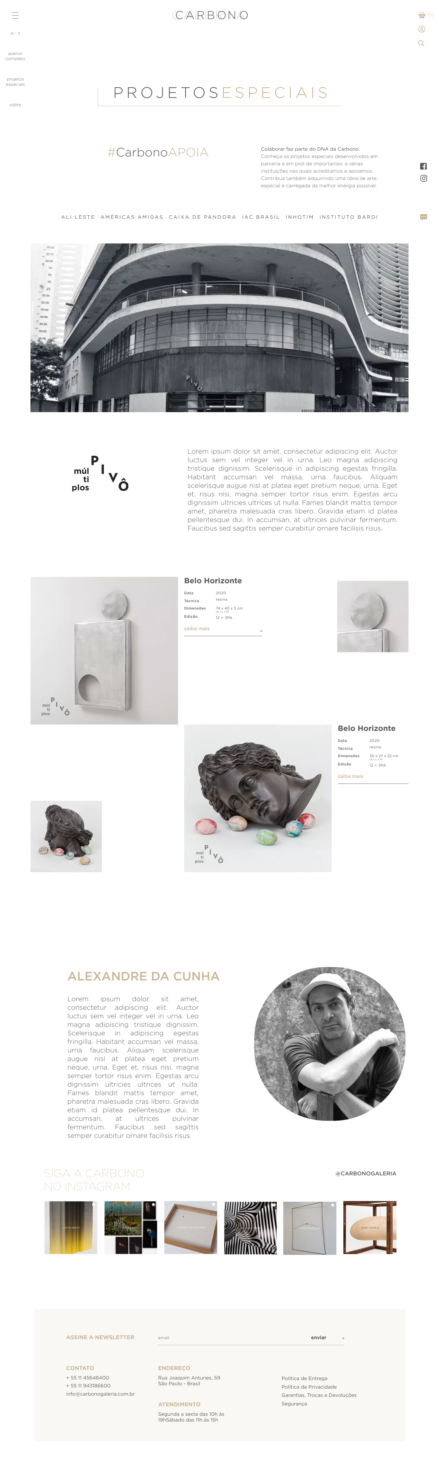 Pivô
Pivô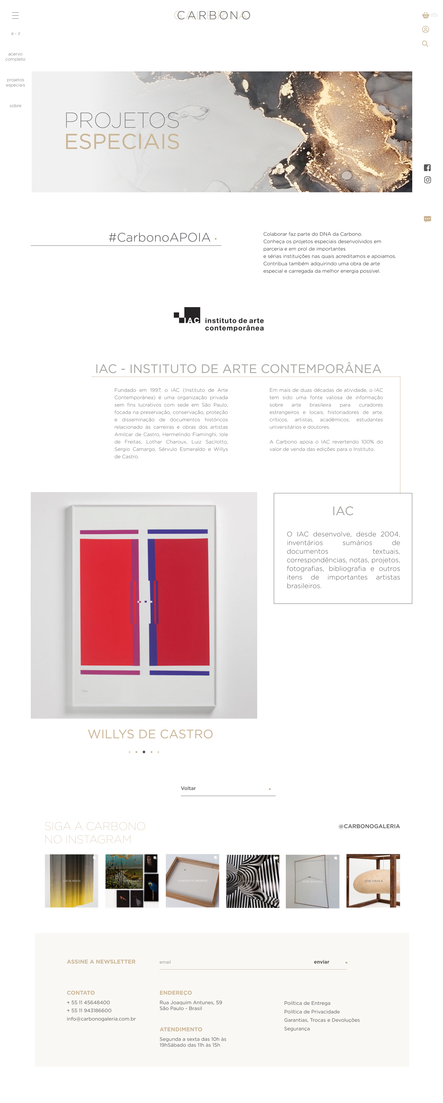 IAC
IAC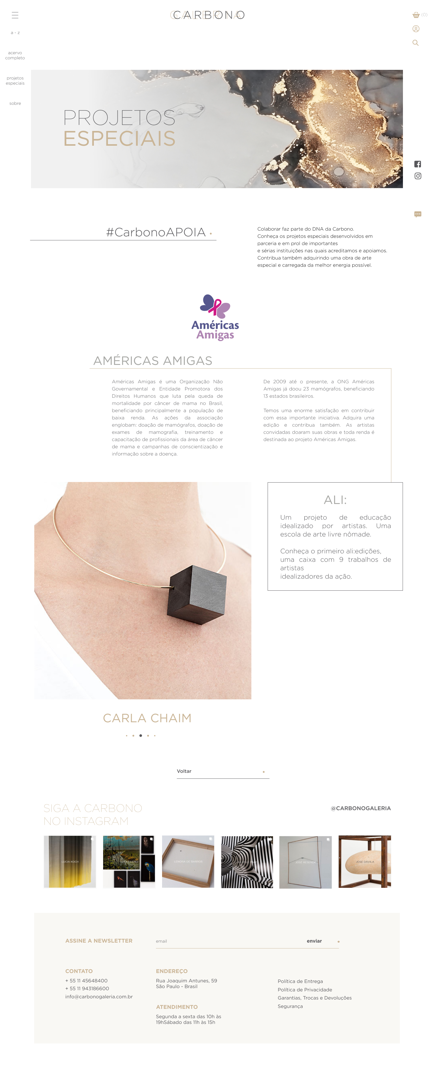 Américas
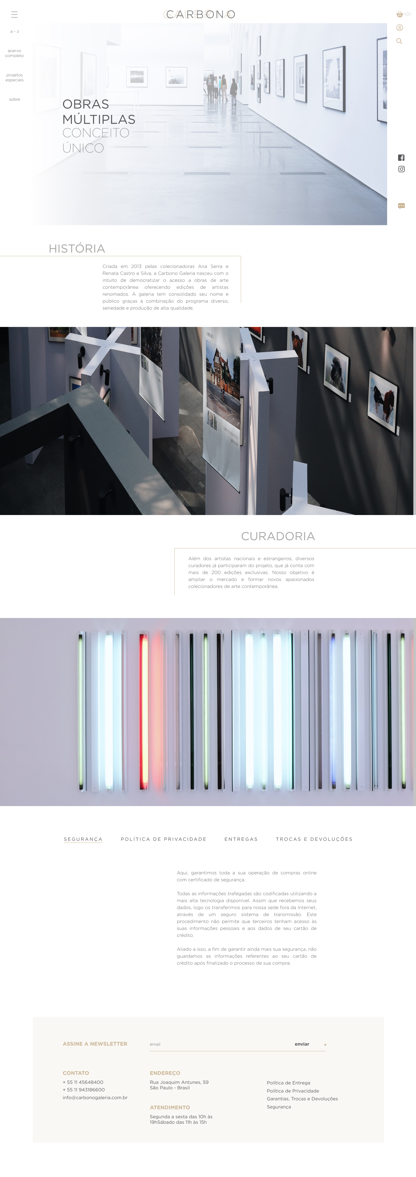 About, full page
Outcome
A site that guides instead of stranding.
The redesign turned a flat catalogue into a navigable gallery: 120 artists moved from a dropdown into dedicated pages, the store stopped hiding, and the whole journey from discovery to checkout to the client's own account was rebuilt on a structure visitors can predict. It shipped as a consolidated component set, ready for development rather than a stack of mockups.
