 Fitto — Brand Identity 2026
Complete visual identity for a functional food brand aimed at athletes and active people — from concept to application across food truck, packaging, apparel, and sporting events.
Fitto — Brand Identity 2026
01 — Context
Fitto was born to solve a real problem: at sporting events, competitions, and active communities, the available food is typically ultra-processed with no nutritional value aligned to performance — or it's "healthy" in a boring way, with no appeal, no flavor, and no identity.
The brand enters this space with high-protein functional sandwiches made with natural ingredients, developed to support performance, satiety, and recovery in a practical and accessible way. The challenge was to create an identity that communicated all of this without falling into the clichés of the fitness segment — lifeless palettes, technical typefaces, and a look that feels clinical.
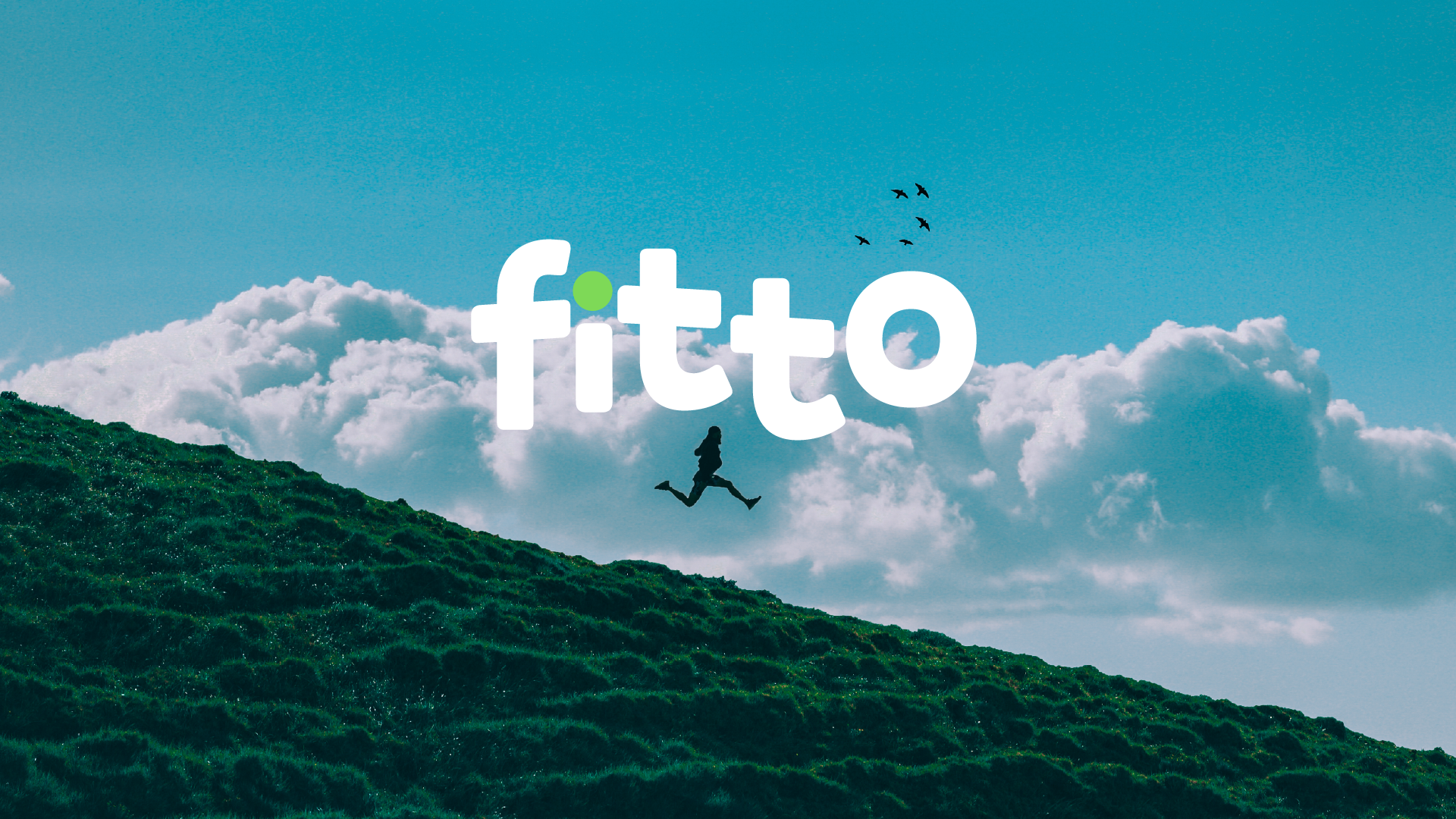
Fitto needed to be vibrant, appetizing, and trustworthy all at once — a brand that looks good and does good.
02 — Process
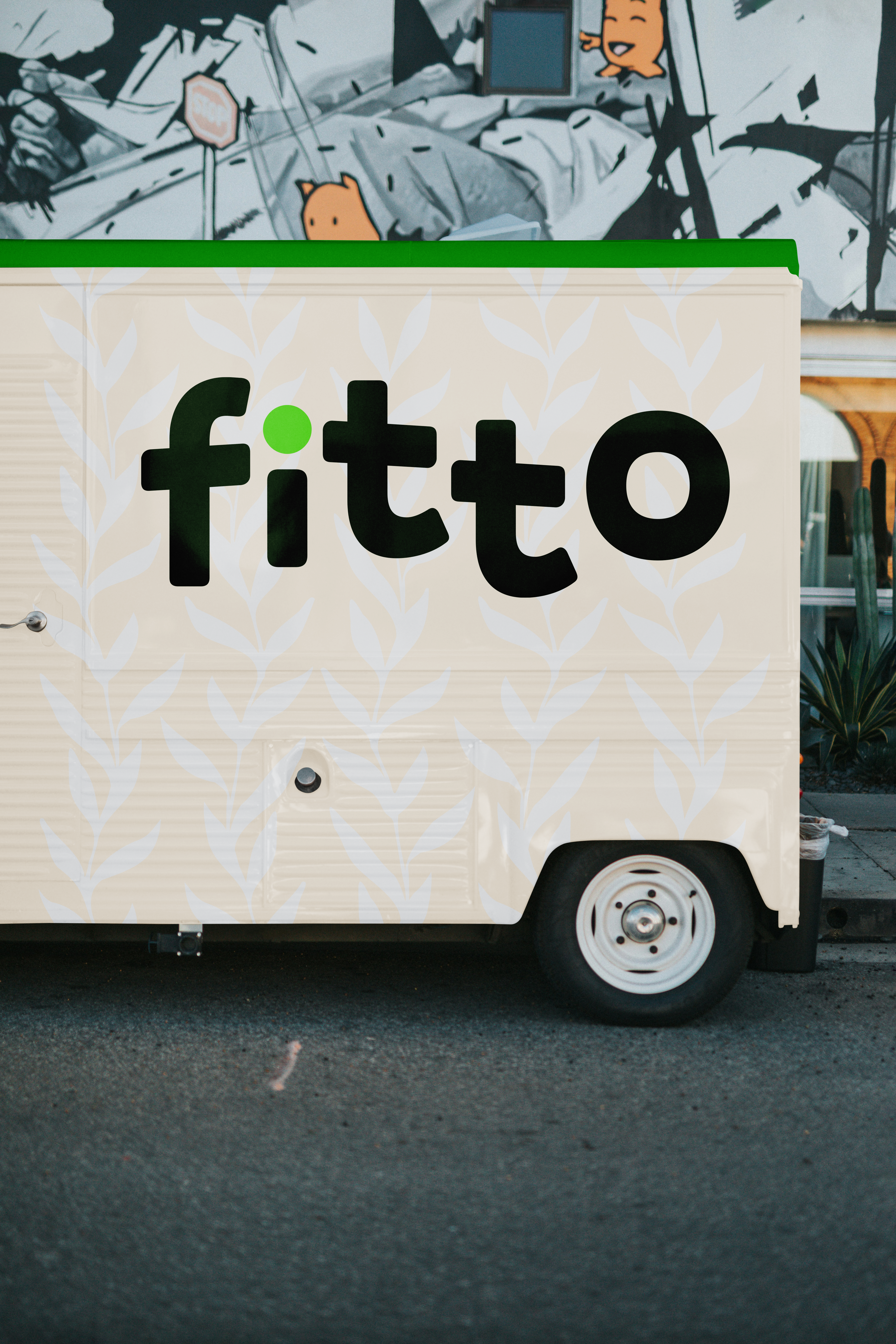
The starting point was understanding the territory: where Fitto exists, who it serves, how it needs to communicate. A brand that lives at sporting events and real physical experiences has specific visual requirements — it needs to work on a t-shirt, food truck, and packaging with equal impact.
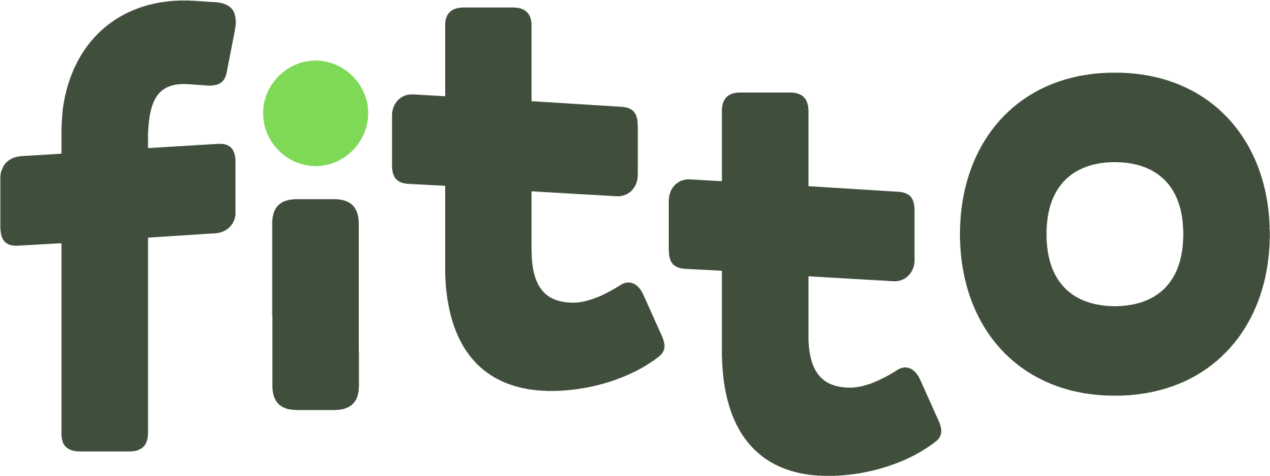
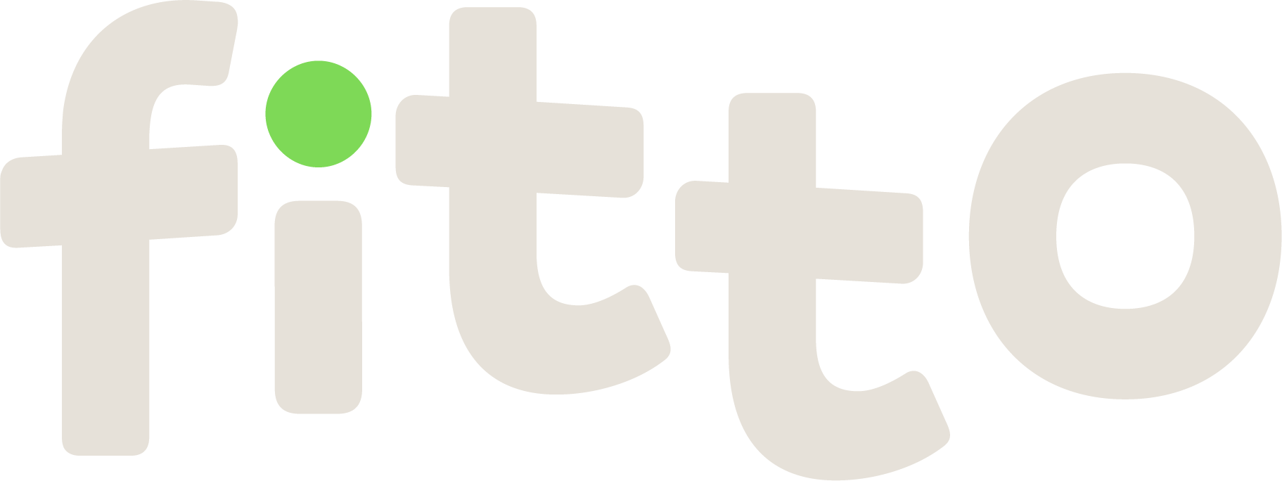
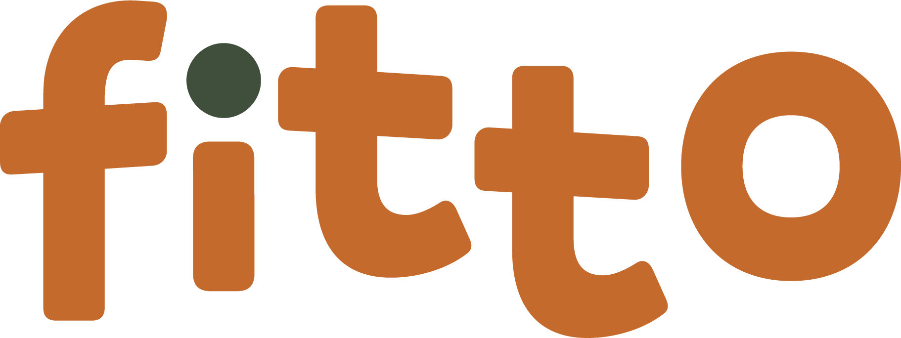
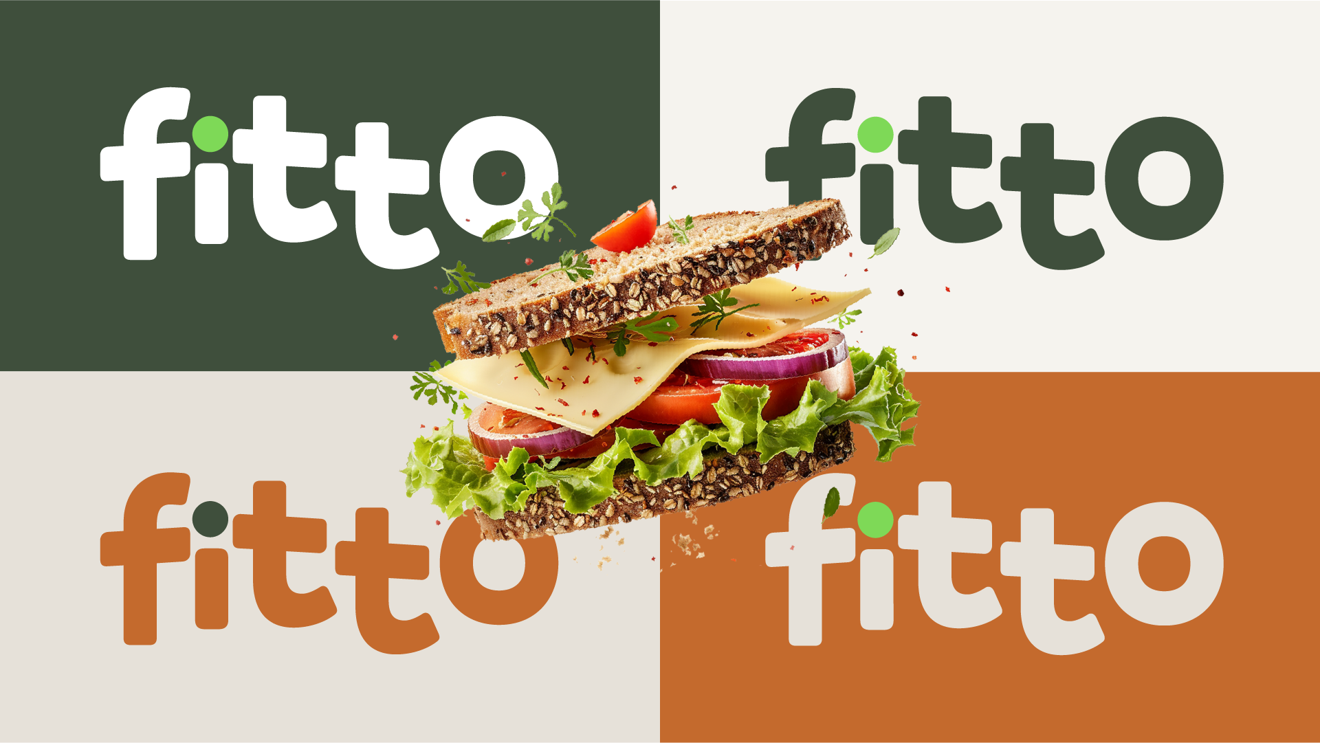
Logo variations

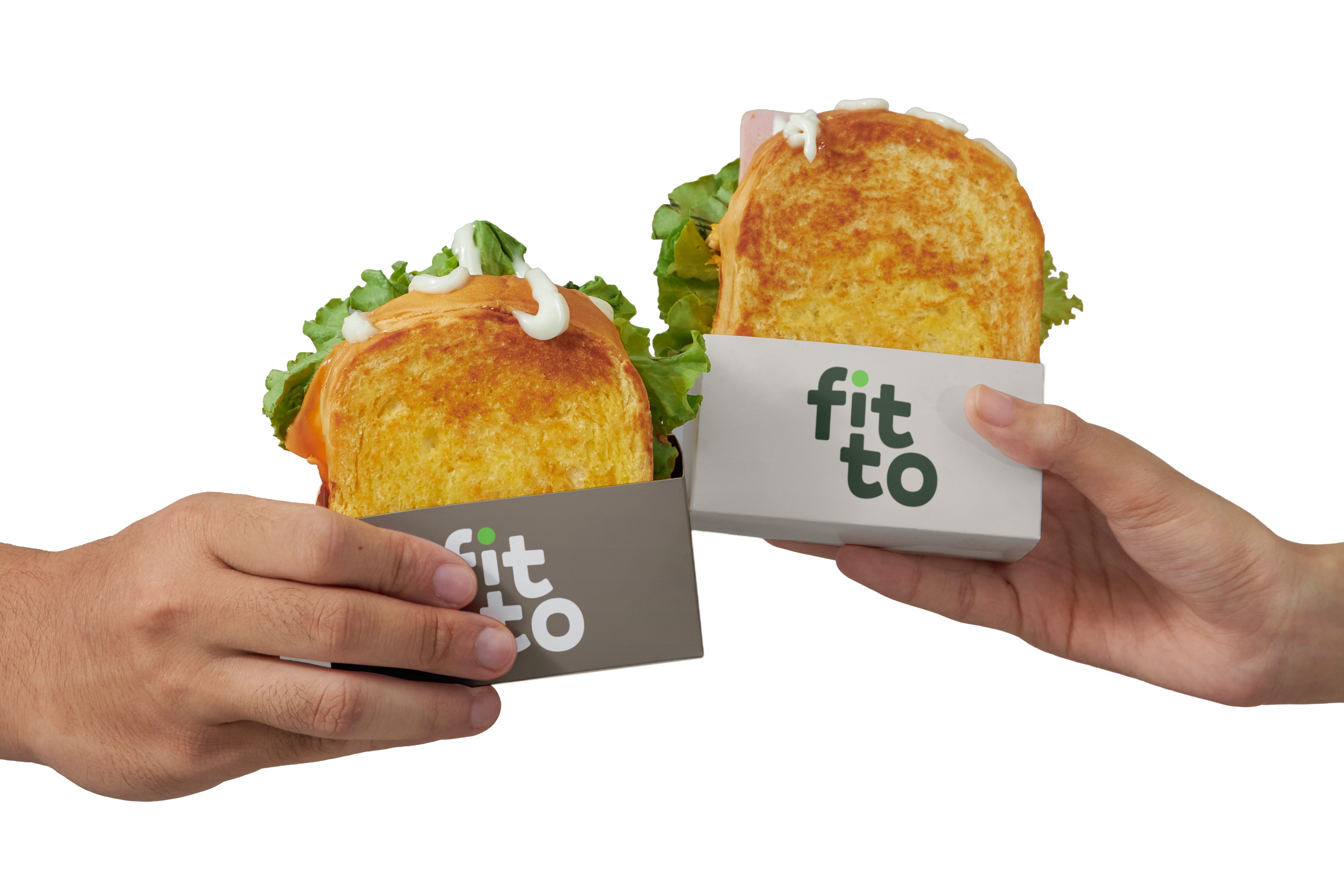
03 — The product
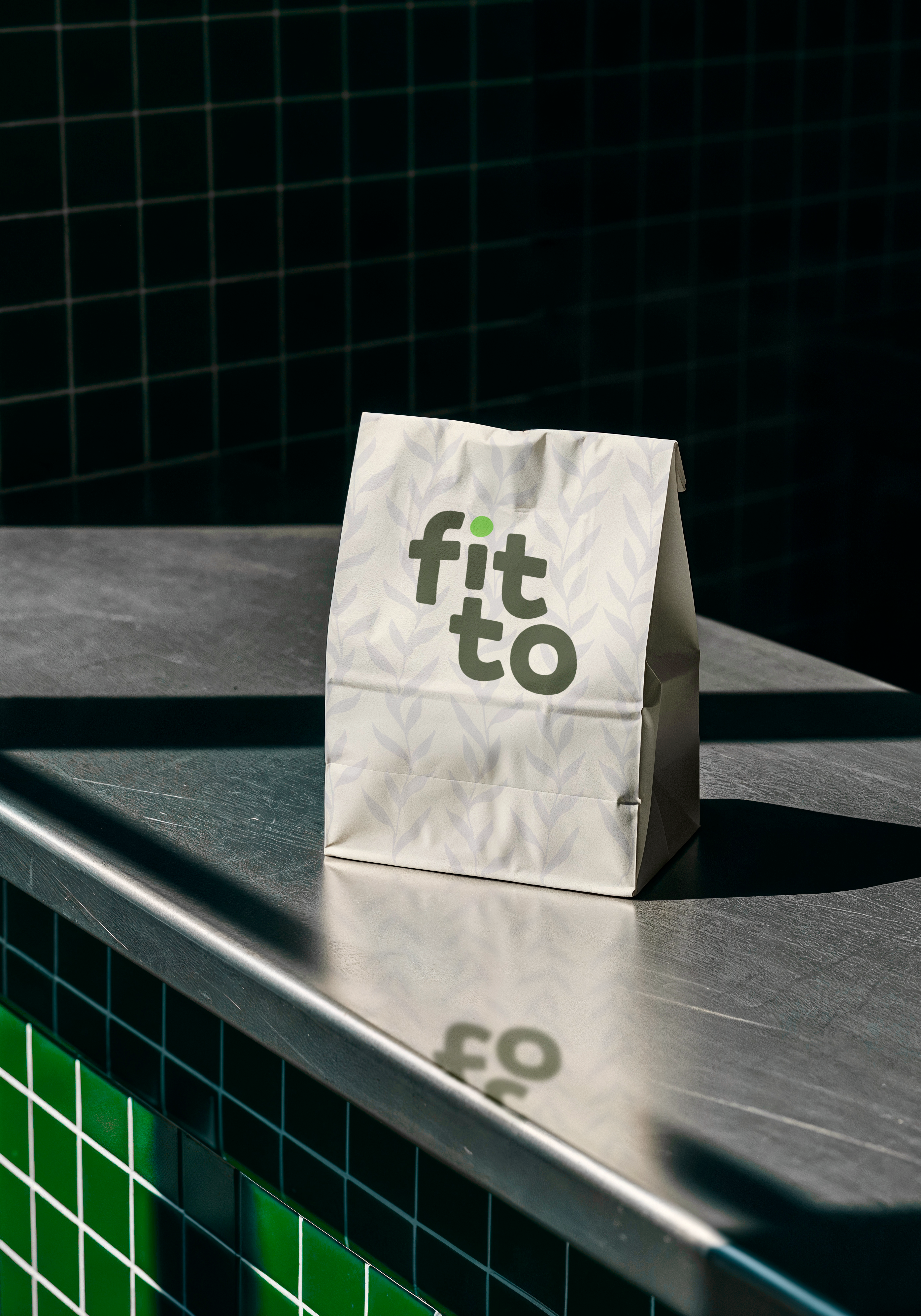
Fitto's product isn't just what's inside the sandwich — it's the complete experience: the packaging you hold in your hand, the ease of eating between competition heats, the satisfaction of a choice that actually makes sense for your training.
The product's art direction was developed to convey naturalness and appetite at the same time — without the technical overreach of the supplements segment, and without the clinical coldness of the "health" market.
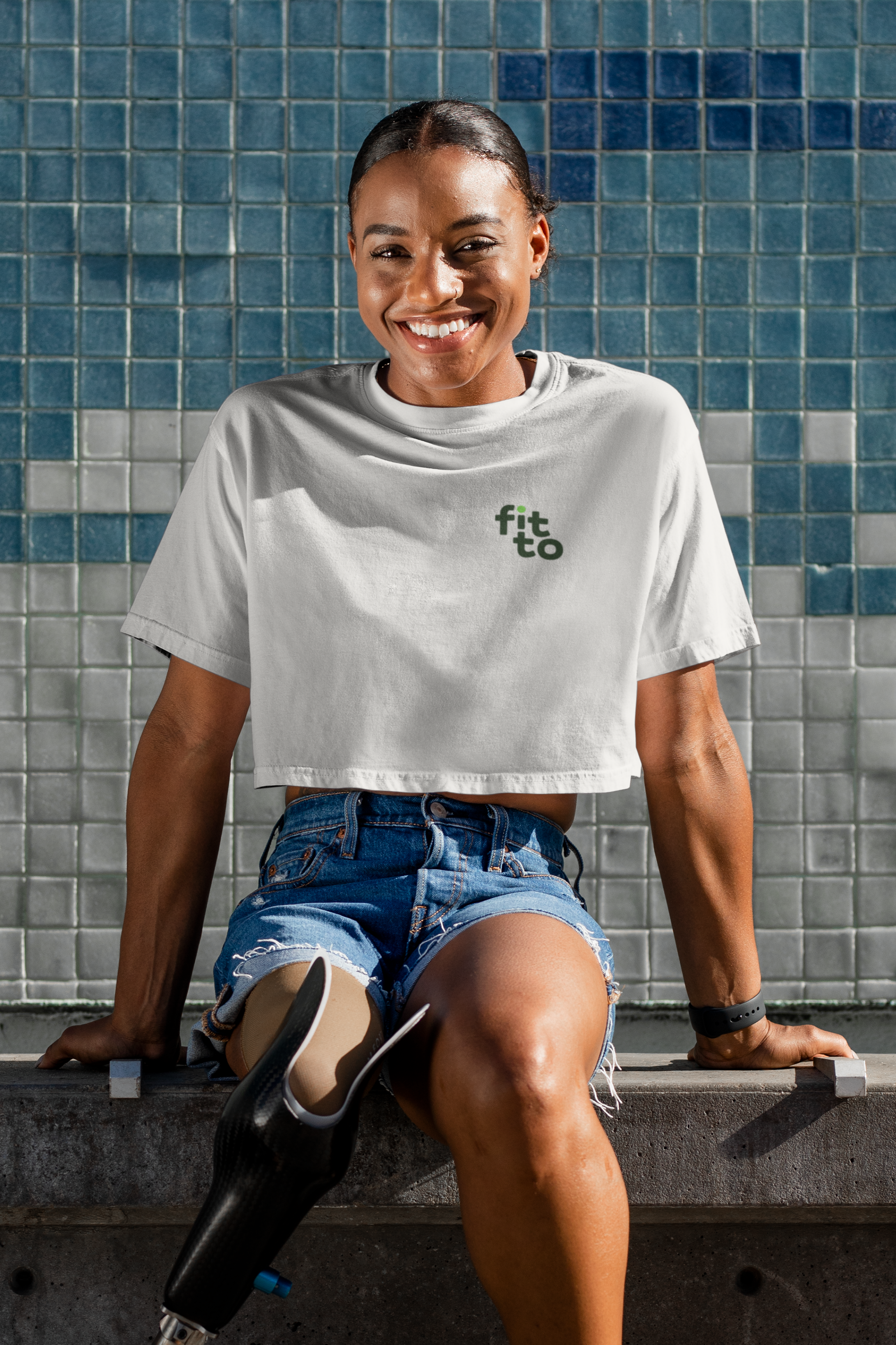
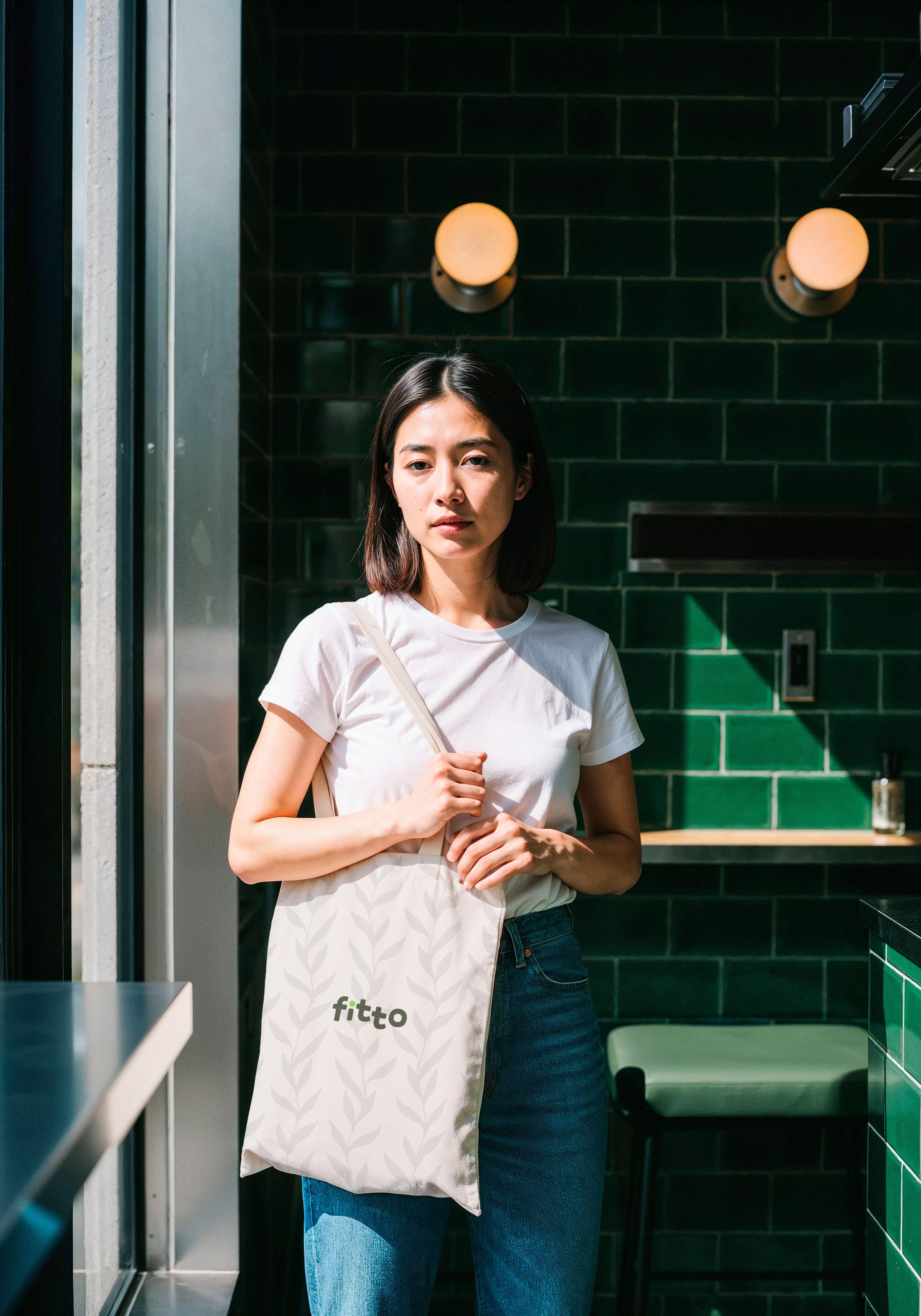
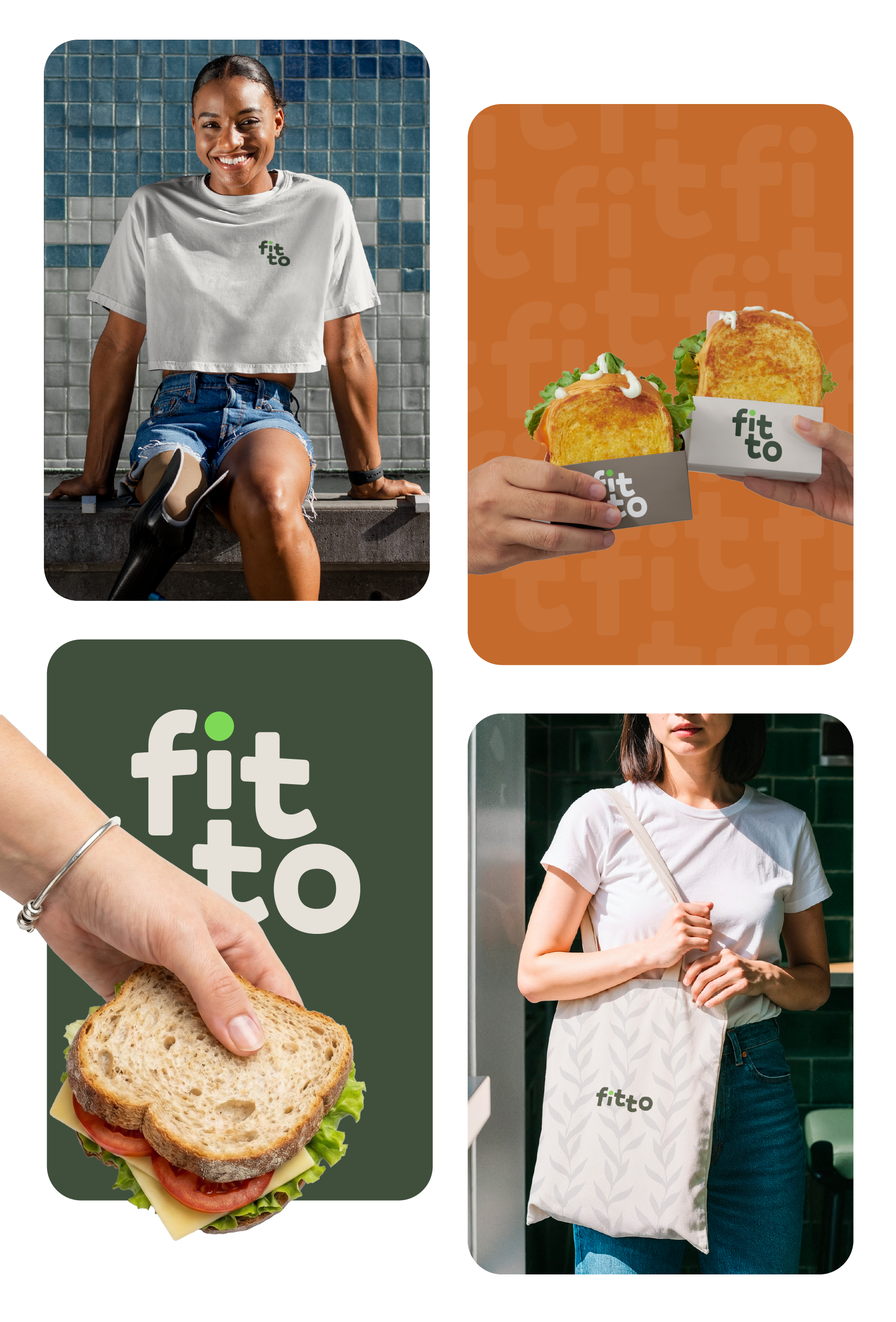
04 — Applications
An identity that needs to work in motion — food truck at an event, team t-shirt, packaging in the athlete's hand, delivery bag. Each application tested to ensure the logo and colors hold up at any scale and in any context.
05 — Result
Fitto enters the market with a complete, consistent, and scalable identity — ready to grow from a single food truck to multiple presences at sporting events without losing visual coherence or positioning.